sustainable

Resource efficiency in Asia Pacific

CLIENT

United Nations Environment Programme

PURPOSE

To convey the scale and complexity of resource use in the Asia Pacific region at a conference of Environment Ministers and subsequently to other audiences.

DESCRIPTION

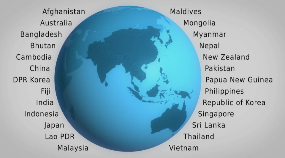
A high impact video and interactive web-tools to introduce and enable easy exploration of a database covering 26 Asia Pacific countries, 157 indicators and 40 years.

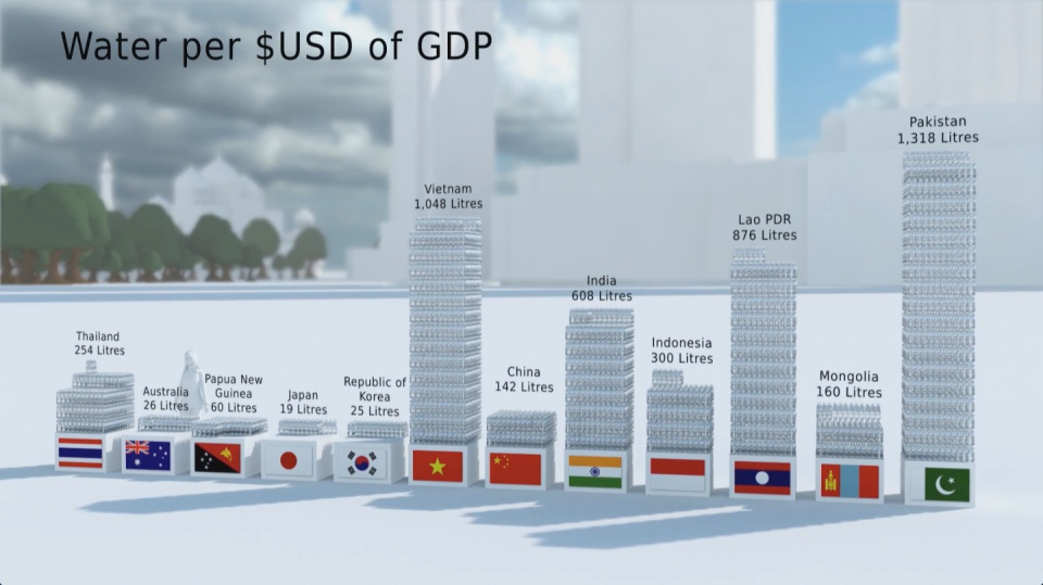
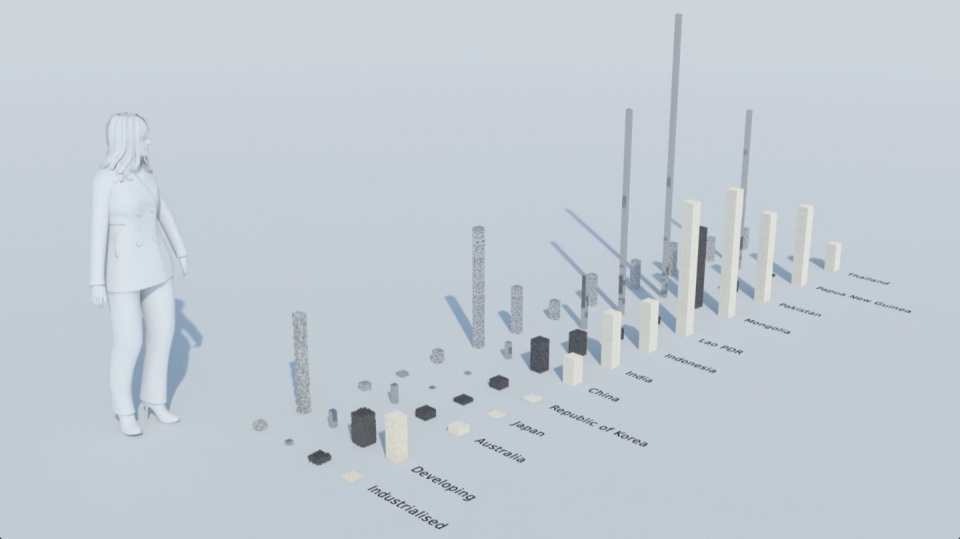
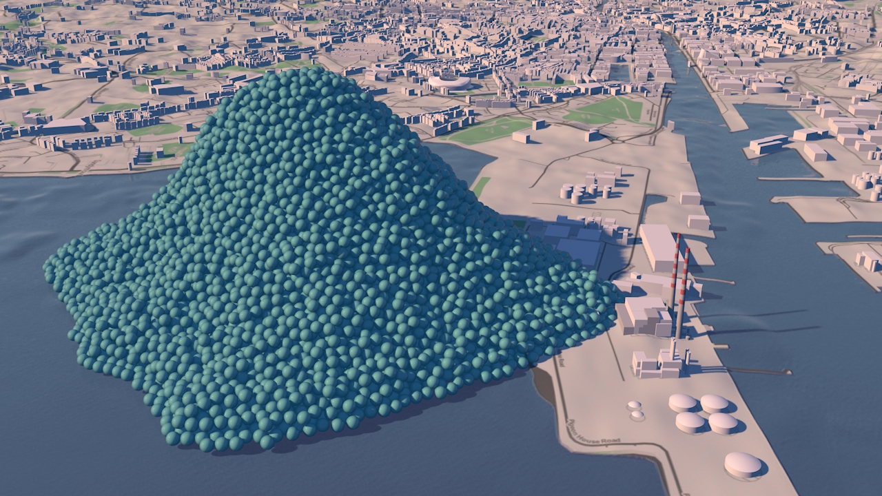
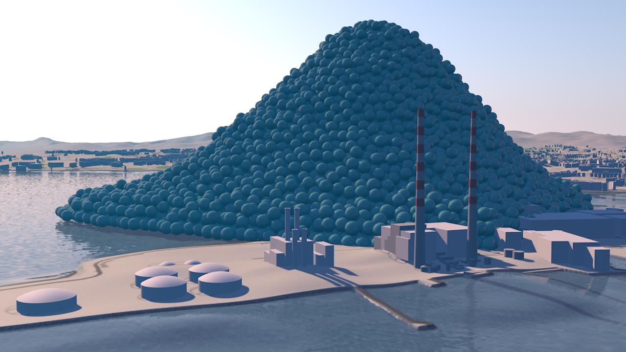
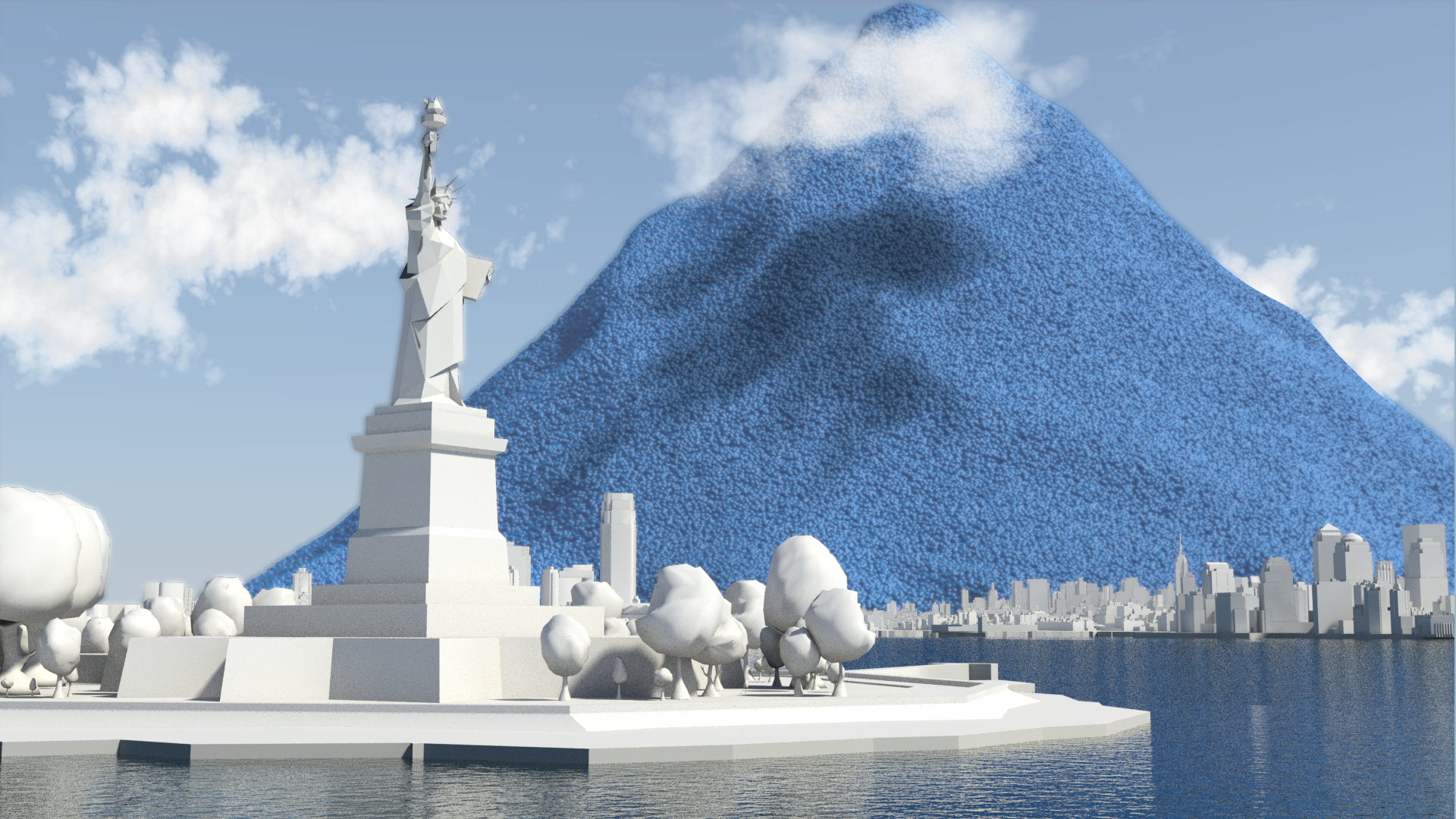
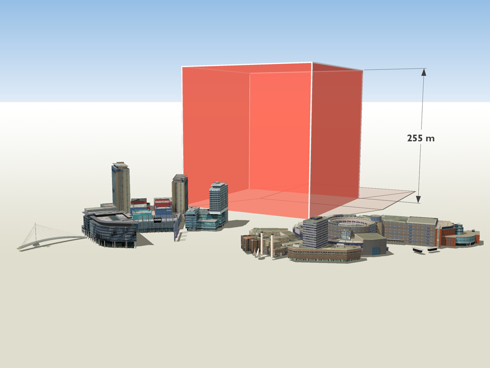
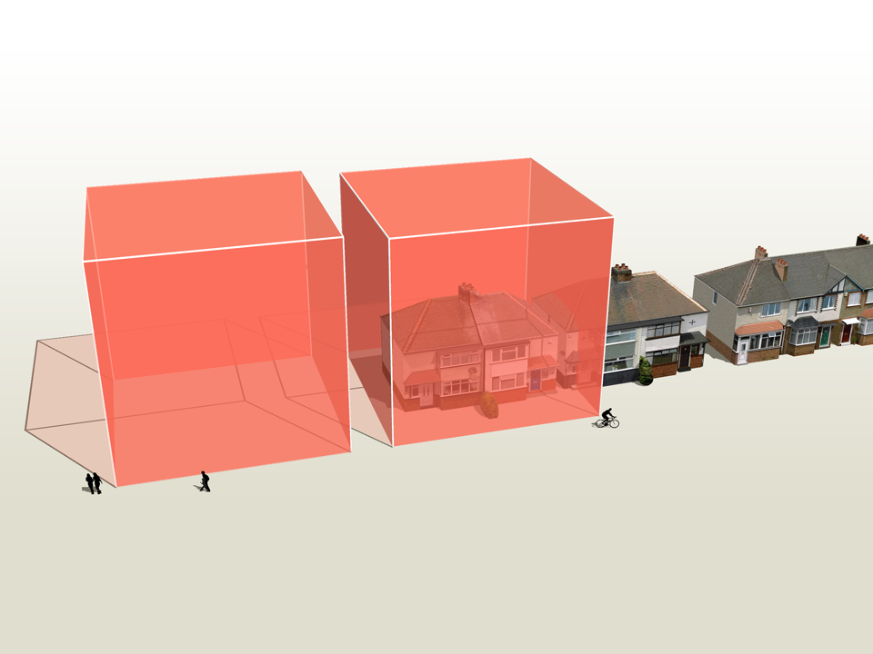
How much natural resources are used to earn one dollar in developing countries in the Asia Pacific region? How do you effectively show water, metal and biomass usage rates across 26 Asian countries - and make it personal and real? What is the best way to visualise a range of environmental resource indicators ‘per GDP’ across countries?

These were some of the challenges set for us by the United Nations Environment Programme (UNEP) in a project undertaken in conjunction with our not-for-profit partner CarbonSense Foundation.

This video has taken our communications to a higher level, and improved our ability to cut across a crowded policy landscape to really help decision makers reflect on resource efficiency.

Janet Salem, UNEP, Bangkok

The brief from the UNEP Bangkok office was to design and create a short, high impact video to convey the scale and complexity of resource use in the Asia Pacific region. In addition a set of interactive web-tools is being provided to complement the film and allow easy exploration of the data.

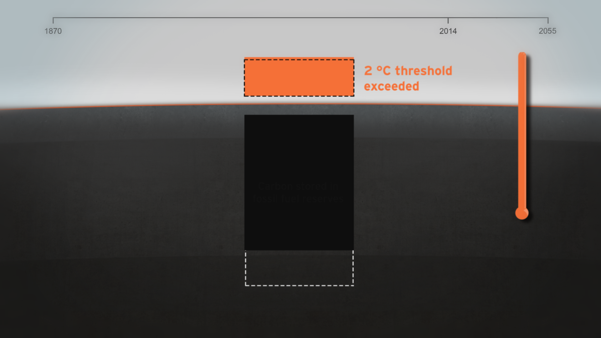
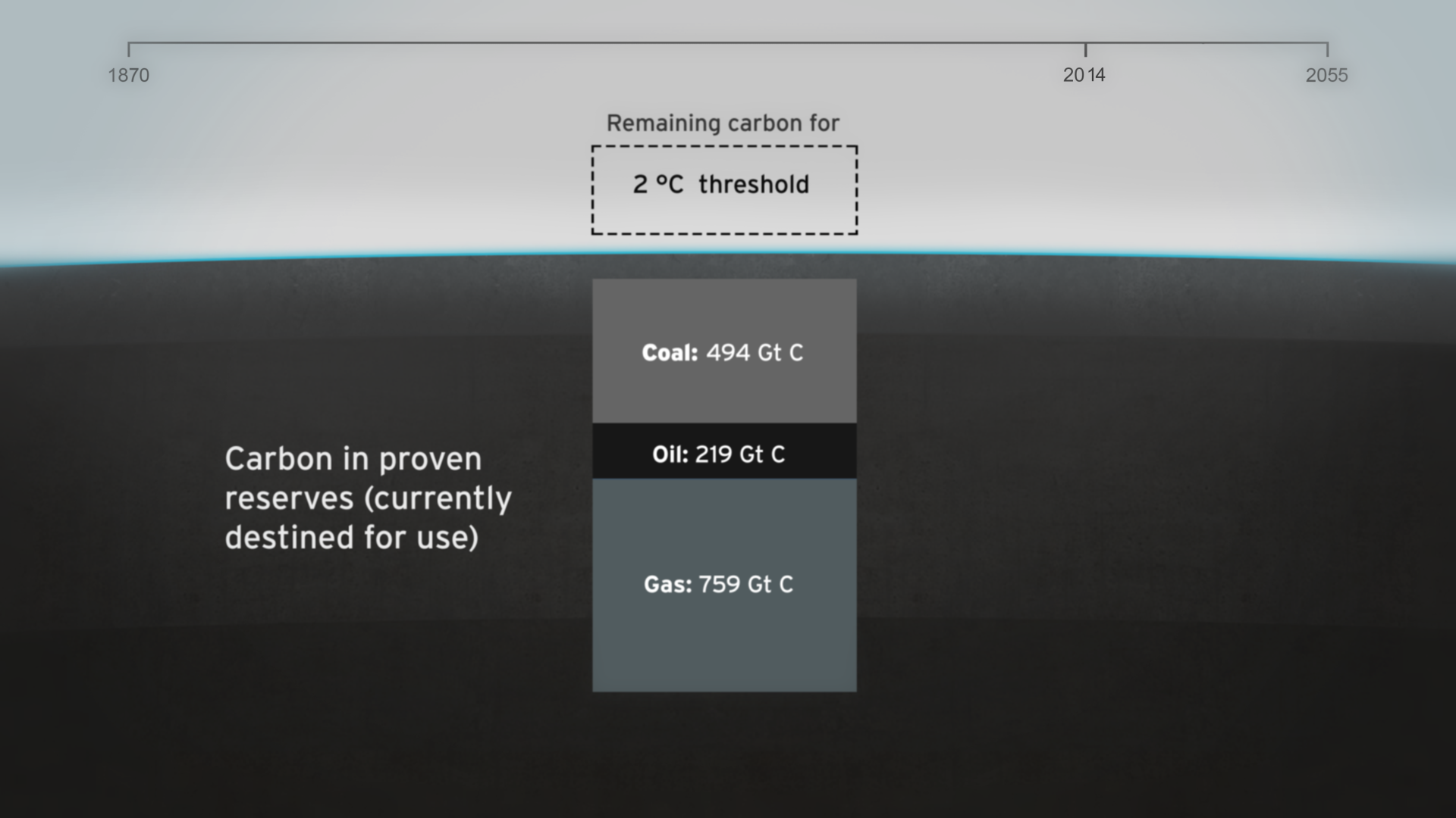
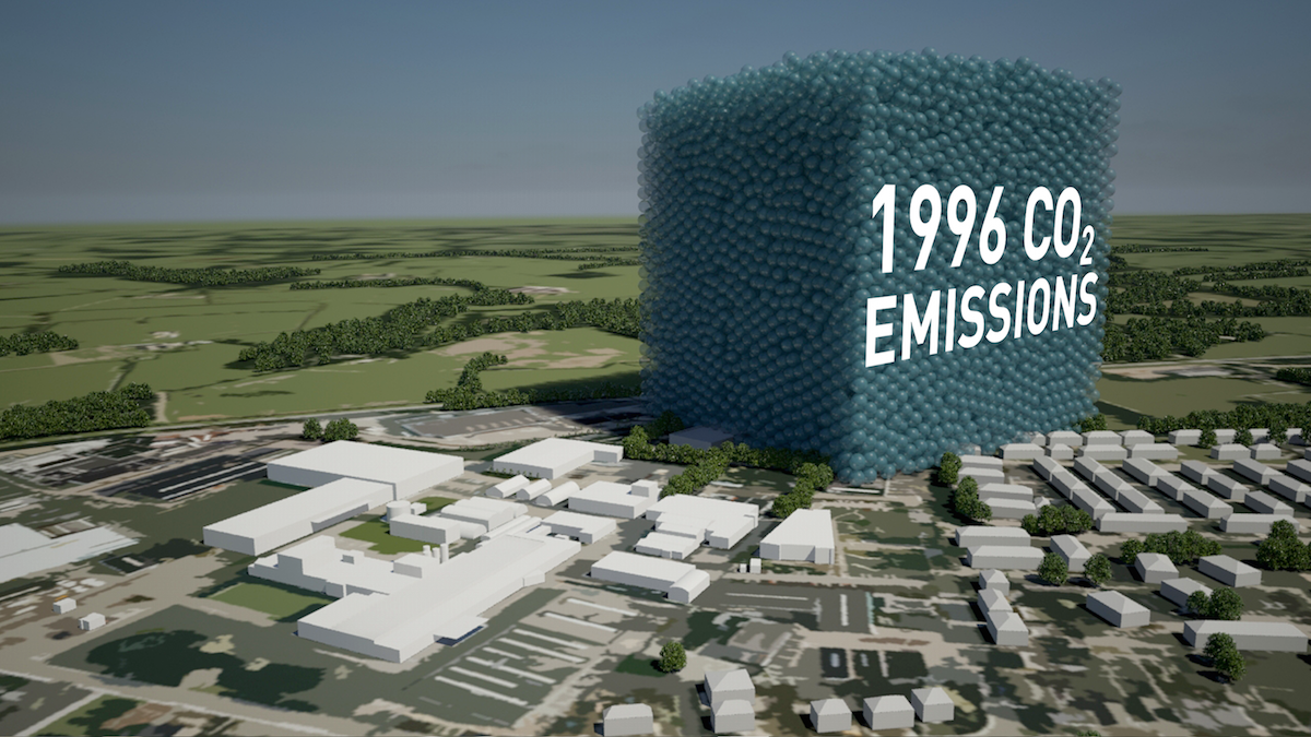
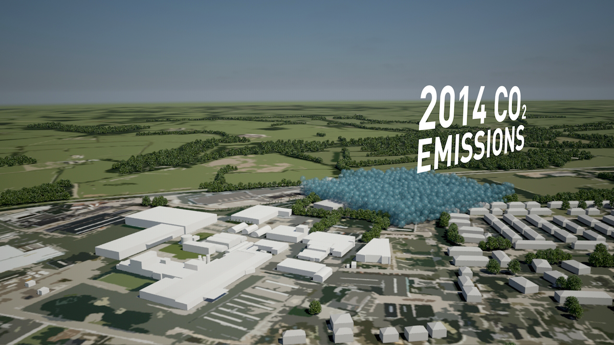
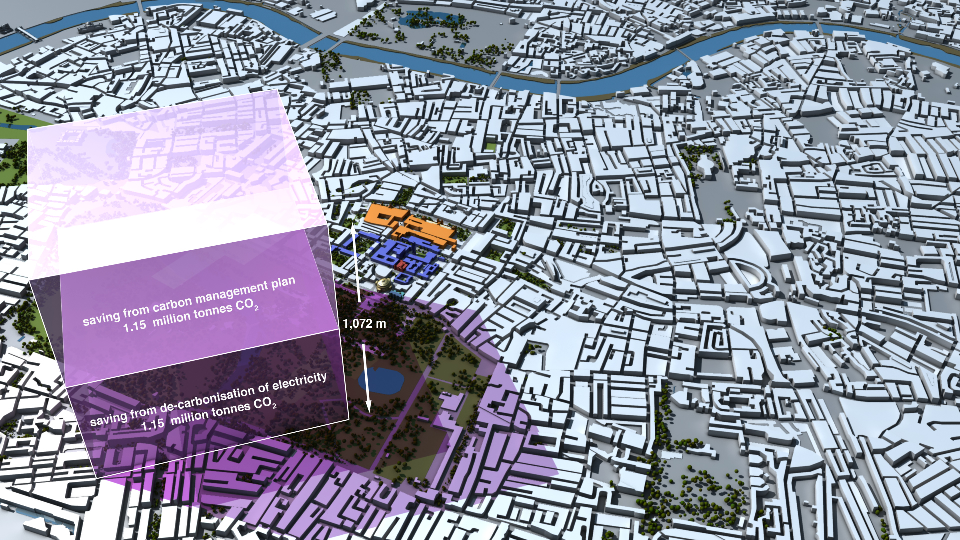
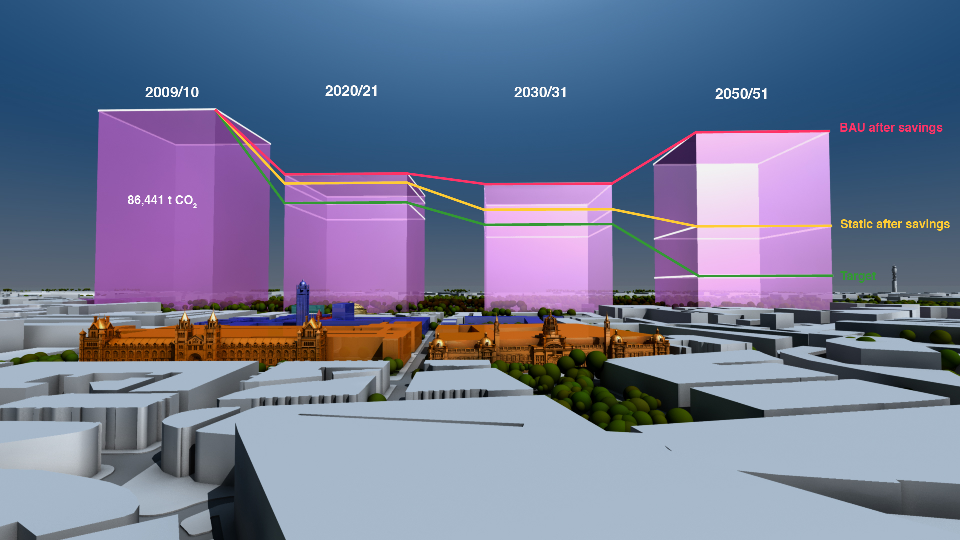
The film is supporting a database of resource efficiency data covering 26 Asia Pacific countries, 157 indicators and 40 years (1970-2010). The indicators are designed to inform policy development in the region based on the principles of circular economy, sustainable consumption and production principles.*

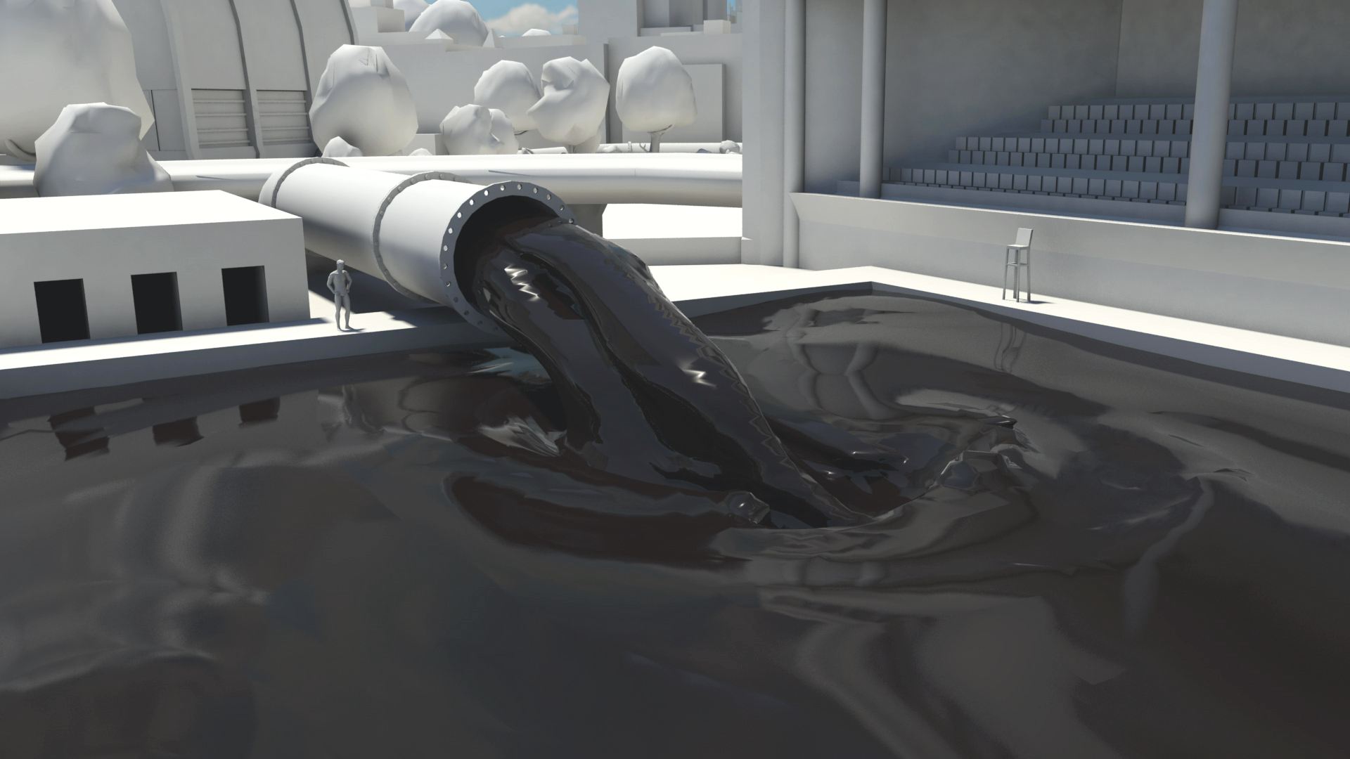
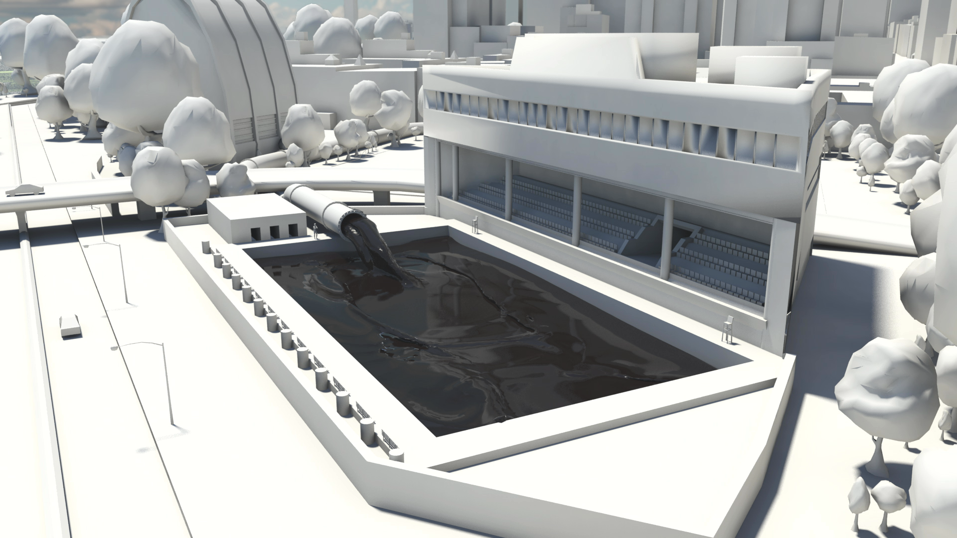
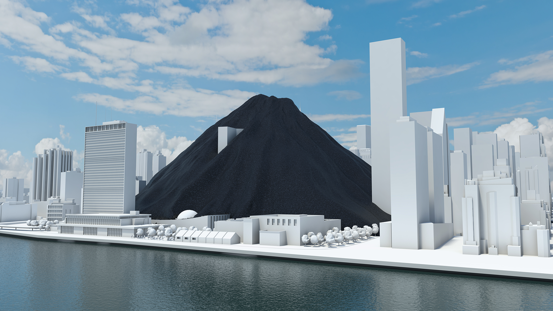
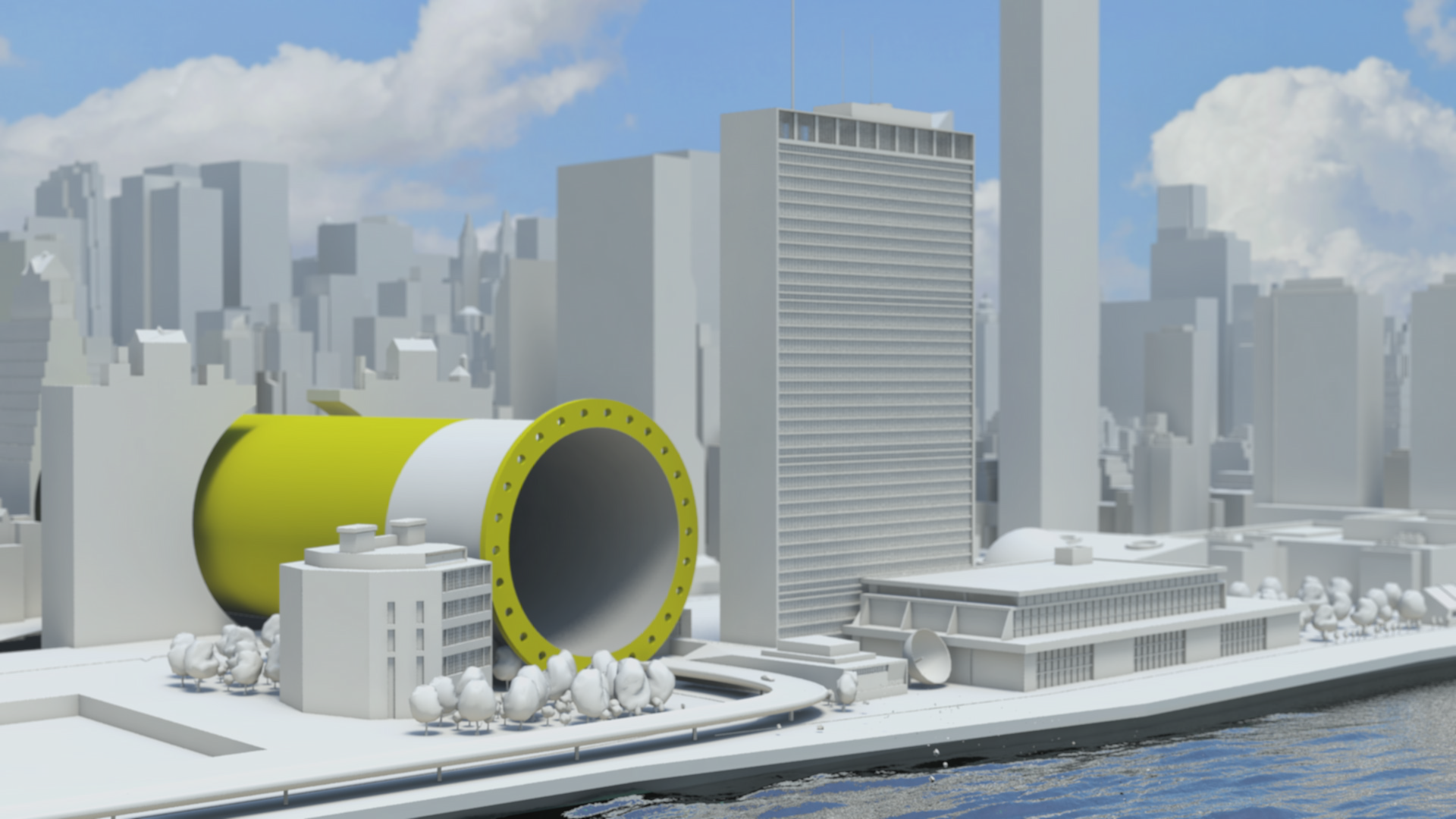
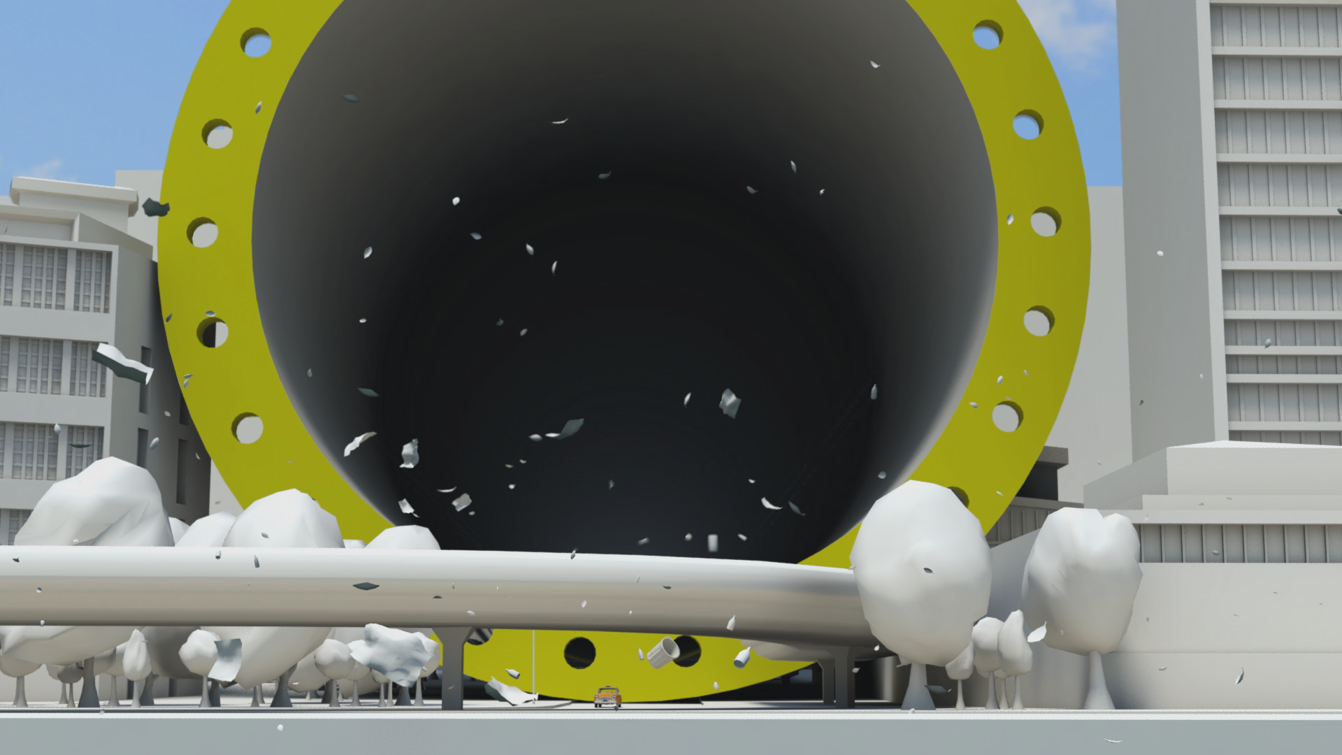
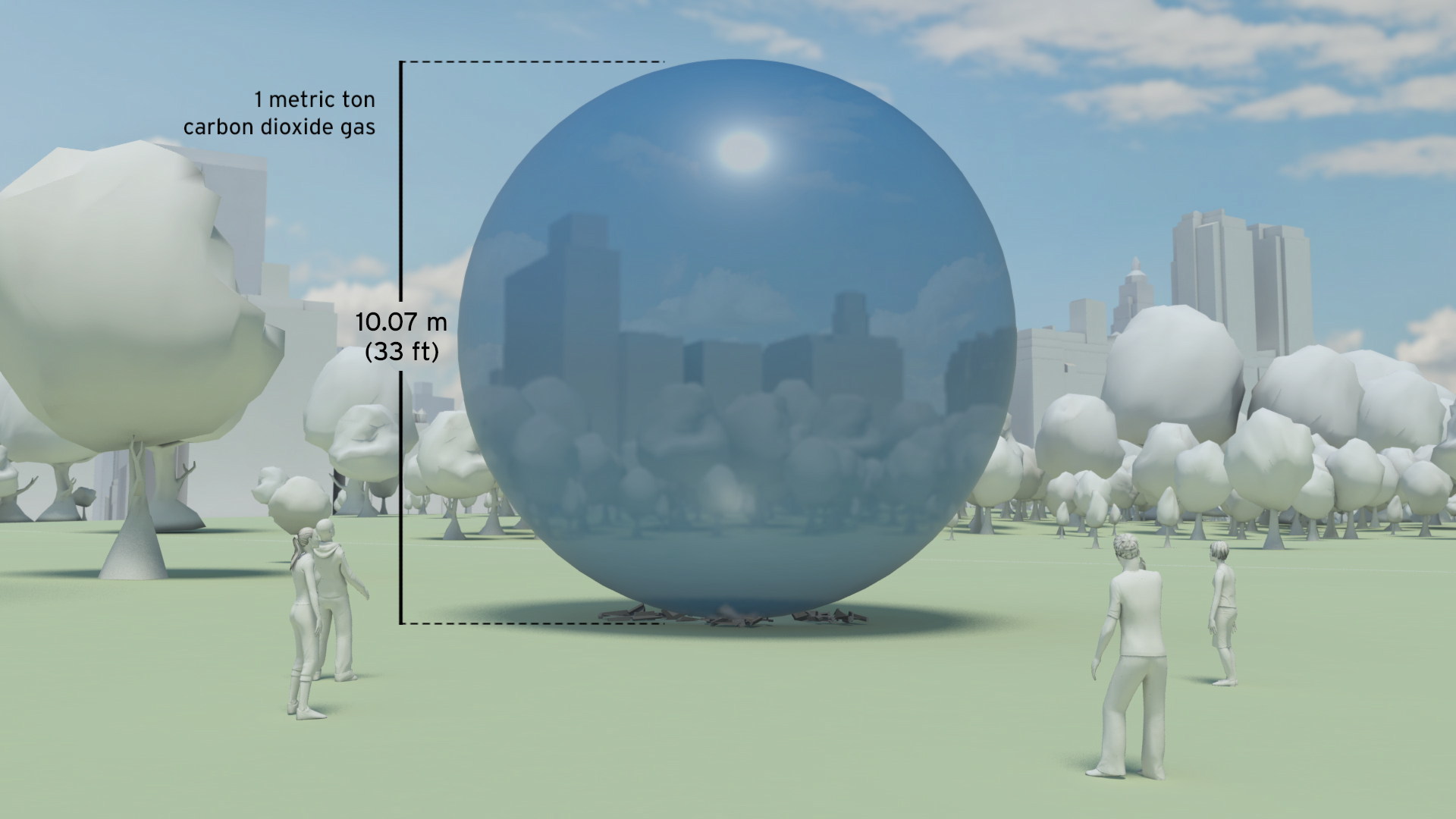
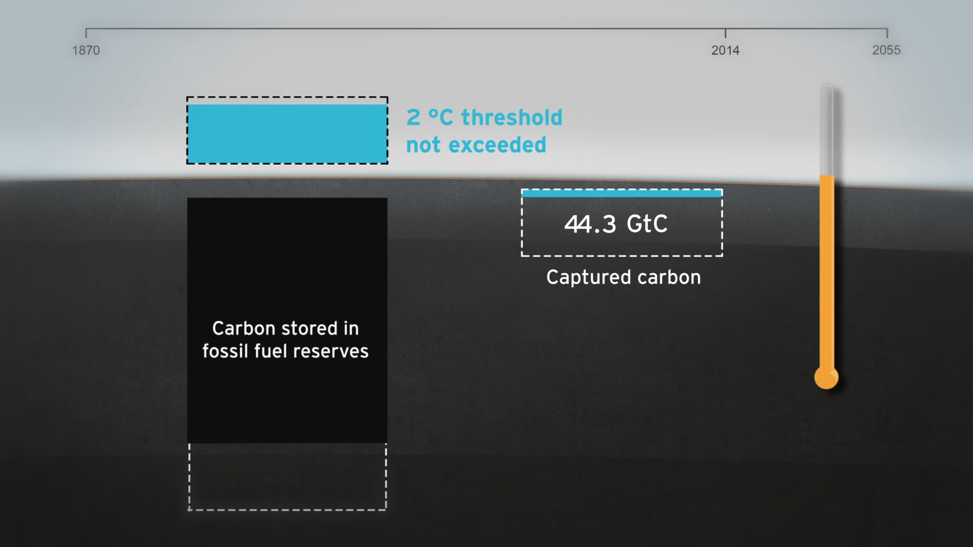
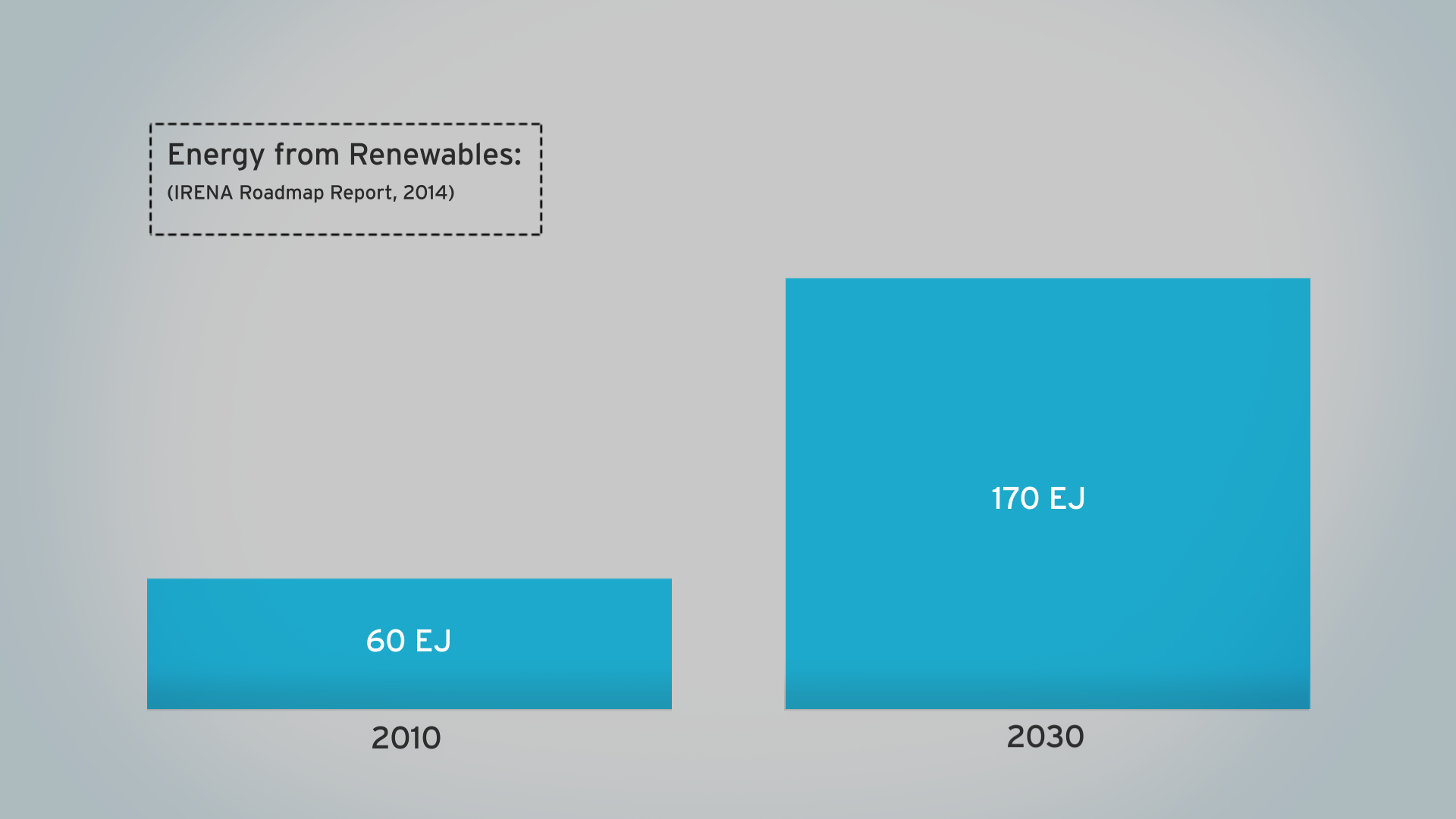
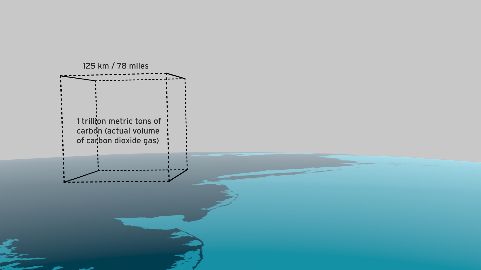
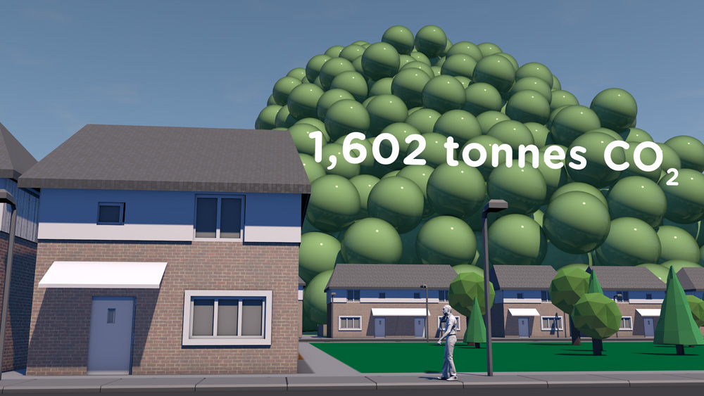
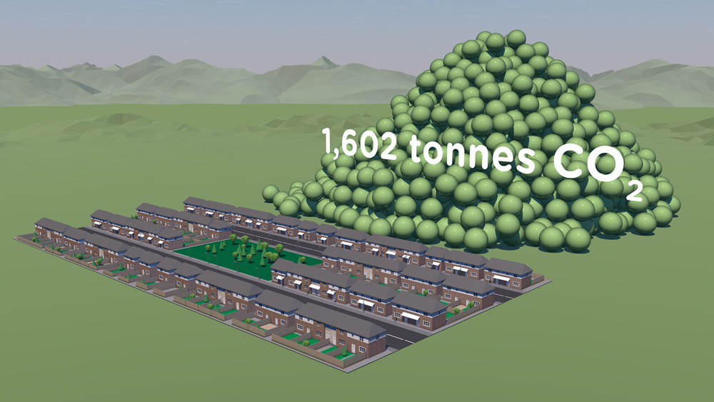
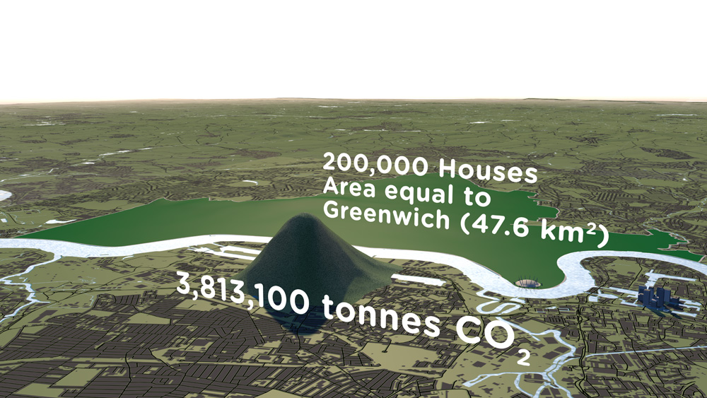
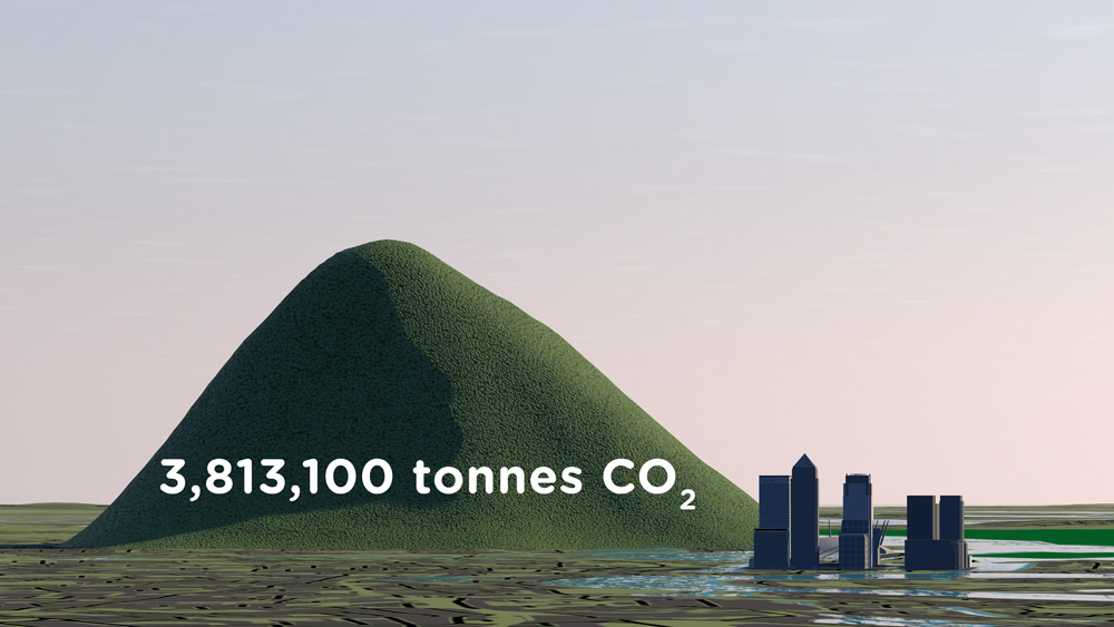
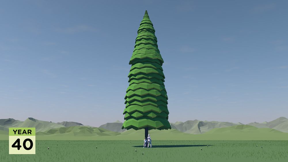
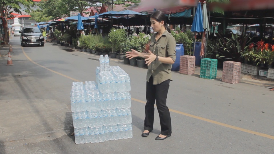
Resource efficiency is crucial for sustainability but how do you make it real and meaningful at a national and a personal level? To bring such a huge subject up front and personal, we combined live action film introducing very real piles of materials on a table-top with national and regional resource use and impacts made tangible with CGI graphics. And uniquely this project allowed us to explore ways that our creative techniques could be combined with economic data.

Because of the complexity of data and fast-track time schedule the project was carried out in a highly collaborative way, with UNEP staff in Bangkok supporting our creative team throughout the scoping, design and production phases.

The film was used to launch the UNEP Report at a conference on 19th May 2015 attended by Achim Steiner, Executive Director of UNEP, and Environment Ministers and policy makers from the Asia Pacific region.

See the UNEP webpage on project here

Finally - a very special thanks to Janet Salem of UNEP, Bangkok and our film presenter / narrator Patchari Raksawong.

*The database has been developed as a result of a three-year science-based consultative process mandated by countries in the region and coordinated by UNEP, the CSIRO and the Asia-Pacific Roundtable on Sustainable Consumption and Production (APRSCP), with support from the European Union's SWITCH-Asia Programme.

An important part of this project was the creation of an interactive web-tool (see above) allowing policymakers to explore the database in detail in an intuitive way. We created a 'heat map' that allows comparison between a wide range of economic indicators for different countries. Mousing over the countries reveals the actual data.

Carbon Visuals has shown us different techniques to visualize data in a way that can resonate on a meaningful human level, while still giving us creative space for collaboration. We had a lot of fun with the team and it's been a really wonderful partnership.

Janet Salem, UNEP, Bangkok

Ireland's carbon footprint

CLIENT

Environmental Protection Agency

PURPOSE

To help the EPA inform a range of audiences, from policymakers to the general public, about Ireland’s greenhouse gas emissions.

DESCRIPTION

A short animation showing Ireland’s daily emissions as a large pile of one tonne carbon dioxide bubbles beside the Poolbeg towers in Dublin bay.

How do you show the carbon footprint of a country? That was the task set by Ireland's Environmental Protection Agency (EPA). The EPA compiles Ireland's annual greenhouse gas emission inventories and projections, which allows the Government to assess progress against key targets, report to the European Commission and UNFCCC and informs policy development and mitigation measures. The EPA also aims to provide up-to-date scientific information to a wide range of audiences, from policymakers to the general public. A simple visual would help to get more people engaged in the issue.

Carbon Visuals created a short animation showing the daily emissions as a large pile of one tonne carbon dioxide bubbles - sitting next to the Poolbeg towers in Dublin bay.

See the EPA webpage here.

TECHNICAL NOTE

The data source for this visualisation is the EPA’s Greenhouse Gas Inventory for 2012 which calculates annual emissions from Agriculture, Energy, Transport, Industry and commercial, Residential and Waste sectors, and was released in 2014.

Each sphere represents one tonne of greenhouse gas as carbon dioxide equivalent - Co2(e). Greenhouse gases other than CO2 (i.e. methane, nitrous oxide and so-called F-gases) may be converted to CO2 equivalent using their global warming potentials.

For 2012, Ireland’s total national greenhouse gas emissions are estimated to be 58,531,238 tonnes or 160,359 tonnes per day.

Carbon dioxide gas at 15 °C and standard pressure has a density of 1.87 kg/m3. At standard pressure and 15 °C a metric ton of carbon dioxide gas would fill a sphere approximately 10 metres across.  The video shows a pile of 160,359 spheres 10 metres in diameter located near the Poolbeg Towers in Dublin Bay, with the city behind.

The case for Carbon Capture & Storage

CLIENT

World Business Council for Sustainable Development

PURPOSE

To engage world leaders, industry experts, campaigners and scientists at the UN Climate Summit, New York, September 2014 and to catalyse and inform conversations about reducing carbon emissions.

DESCRIPTION

Film showing actual quantities of global fossil fuel consumption and carbon emissions, and the part that carbon capture and storage can play in limiting global climate change to 2 degrees.

Among all of the documents, reports and images being released around the UN summit, we hope that this film will stand out and benefit all participants, as well as anyone who watches it around the world.

Peter Bakker President, WBCSD

A coal pile buries the UN General Assembly, gas races down 42nd Street and then New York is lost under a blue mountain. These dramatic CGI scenes, depicting actual quantities, create an immersive journey that brings home the scale of global carbon emissions and fossil fuel consumption.

This dynamic four-minute film, being launched at the UN Climate Change Summit in New York September 2014, shows the part that carbon capture and storage can play in limiting global climate change to 2 degrees.

Commissioned by WBCSD and produced by Carbon Visuals, the animation is being shown to world leaders, industry experts, campaigners and scientists at the Summit to help catalyse and inform conversations about reducing carbon emissions.


Key messages of the film:

  • use of renewables is increasing
  • but energy use is rising faster
  • fossil fuel use is increasing not decreasing
  • if carbon stored in fossil fuel reserves is burnt we exceed 2 degrees warming by 2055
  • carbon capture & storage (CCS) is an essential part of the 2 degrees solution

Technical note
The volumes of coal, oil, gas and CO2 shown in the film are accurate volumes based on best available data. A detailed Technical Data Methodology document has been produced to accompany the film. This shows all data sources, assumptions on future global renewable and non-renewable energy requirements and the potential of carbon capture and storage technology.

See the Methodology Document for more details

In 2012 we added over 39 billion metric tons of carbon dioxide to the atmosphere. That’s 1,237 metric tons a second. 

It is like a ‘bubble’ of carbon dioxide gas 108 metres across entering the atmosphere every second of every day. We could fill a volume the size of the UN Secretariat Building with our carbon dioxide emissions in less than half a second. We could fill it 133 times a minute.

The pile of one metric ton spheres in the film, which represents one day’s emissions, is 3.7 km high (2.3 miles) and 7.4 km across (4.6 miles).

The world gets through a lot of fossil fuels:

  • 7,896.4 million metric tons of coal a year (21.6 million metric tons per day, 250 metric tons per second)

  • 91,330,895 barrels of oil per day (168 m3 per second)

  • 3,347.63 billion m3 of natural gas per year (9.2 km3 per day, 106,082 m3 per second)

This film tries to make those numbers physically meaningful – to make the quantities real; more than ‘just numbers’.

The coal we use each day would form a pile 192 metres high and 546 metres across. We could fill a volume the size of the UN Secretariat Building with coal every 17 minutes.   At the rate we use oil, we could fill an Olympic swimming pool every 15 seconds.

This would fill a volume the size of the UN Secretariat Building with oil every 30 minutes.

The rate at which we use natural gas is equivalent to gas travelling along a pipe with an internal diameter of 60 metres at hurricane speeds (135 km/h / 84 mph). We could fill a volume the size of the UN Secretariat Building with natural gas in under 3 seconds.

We use a cubic kilometre of gas every 2 hours 37 minutes and a cubic mile of the stuff every 10 hours 54 minutes.

A set of shorter clips has also been released, featuring some of the most impactful scenes of the main film. These are intended for use by everyone, from industry through to educators and campaigners. Get in touch if you would like hi-res versions.

Main film and extract films can be viewed on YouTube:

Whole film

Fossil Fuels Extract

Carbon Dioxide Extract

Natural Gas Extract

Oil Extract

Coal Extract

All images are available under Creative Commons licence to download on our Flickr page

See blog background story.

NHM sustainability engagement

Waterhouse Building, Natural History Museum

Waterhouse Building, Natural History Museum

CLIENT

Natural History Museum

PURPOSE

To plan sustainability communications and engagement.

DESCRIPTION

Attitudinal research, energy control map, segmentation, engagement guidance and reports.

In Spring 2014 we were invited to work with the Natural History Museum on internal sustainability engagement. As with other great museums, integrating modern systems into heritage buildings and maintaining the conditions required for precious collections provide particular challenges for energy managers.

A decade previously, our founding partner CarbonSense was instrumental in the formation of the Museums and Galleries Energy and Carbon Forum which brought together managers of energy and estates from around the UK to share best practice. CarbonSense also contributed to the formulation of an Invest to Save project - the 1851 Estate Carbon Reduction Plan - and thereafter seconded a Low Carbon Manager to the Natural History Museum for two years. Subsequently, Carbon Visuals has provided a range of innovative visuals for this project and also for some of the individual partner institutions including Imperial College and the Royal College of Music.

While judicious investment in infrastructure can deliver improvements, a key to sustained progress on emissions is to also engage everyone in working together towards a low carbon future. We advised NHM on taking a strategic and evolutionary approach over a number of years. We started by conducting informal interviews with selected personnel throughout the organisation and developing a fresh, upbeat and non-technical approach to internal communication on sustainability.

Working closely with the Energy Manager, we used a unique process of energy control mapping based on assessing the extent to which employees and others can control or influence energy use and emissions, and as a precursor to setting levels of ambition accordingly. Case study areas were identified with employee profiling and segmentation. A set of desired outcomes was developed and trialled with the Environmental Group – a cross-Museum managers group charged with ensuring engagement within their own areas.

The Museum has subsequently embarked on the development of an Energy and Sustainability Strategy, including communication and stakeholder engagement, to establish a clearer focus on taking this work forward.

Carbon Visuals brings a powerful analytical approach to sustainability engagement that can be of great help in preparing internal communications, ensuring that issues can be addressed, costs and benefits assessed and a campaign launched on a sound footing.

Declan Rajasingam, Energy Manager, Natural History Museum

Making sense of carbon, trees and timber

CLIENT

Wood for Good

PURPOSE

To find a new way to communicate the carbon benefits of using wood and timber in the UK construction sector.

DESCRIPTION

A series of short animated films and case study images using Wood for Good’s data to reach construction professionals, policy makers and the public.

The competence and skill you have in handling large data sets is absolutely fantastic. And you still delivered a wonderful set of visuals for us that we can continue to use for a long time to come.

Craig White Chairman, Wood for Good

How much carbon is stored in a tree? How does that translate into cut timber and wood products? And how much carbon can be ‘banked’ by using timber for building houses in the UK?

These questions are raised and answered in a communication project that includes a series of short animated films and set of case study images created by Carbon Visuals for Wood for Good, the UK's wood promotion campaign.

The aim was to find a new way to communicate the positive carbon benefits of using wood and timber in the UK construction sector not just to construction professionals but also policy makers and the public.

Given the wide nature of the brief we agreed with the client to start the project with a scoping phase. During this, it was decided to split the film into three separate sections that could each work as short stand-alone films, rather than only as one single complex narrative. In addition we agreed to create a set of case study best practice images showing the carbon ‘banked’ in high profile buildings and timber products.

It has been very satisfying to shape and create a project which has both a business focus and important educational potential. I would like to see us working with more trade bodies and campaigns that have an important carbon message to get across.

Antony Turner, CEO Carbon Visuals

By liaising closely with the client in this initial phase we were able to spend time working up a communications plan, sourcing and examining appropriate data and creating draft film storyboards. This established a sound basis for the production schedule, culminating in all visual materials being ready for the campaign launch.

Data Sheet with methodology, data and references available here.

See Wood for Good website page here.

See our post-production video (giving insight from our clients on the project) here.

Visualising a 90% carbon reduction

CLIENT

Interface

PURPOSE

To show the 90% carbon reduction achieved since 1996 at the European manufacturing facility in the Netherlands.

DESCRIPTION

Short animation that can be used on social media together with before and after images showing the Scherpenzeel factory and surroundings with the dramatic reduction in emissions.

In the past three years we have taken huge strides towards our Mission Zero goal.
To put it in context, we are now operating our European factories with a 90% reduction in greenhouse gas emissions compared to 1996 while the EU Commission has set an EU carbon reduction target of 40% by 2030.

Rob Boogaard, CEO Interface Europe

Carbon Visuals has helped Interface, the carpet tile manufacturer and pioneer in corporate sustainability, show the impressive 90% carbon reduction achieved since 1996 at its European manufacturing facility in the Netherlands.

We created a 3D model of the Scherpenzeel factory and surrounding area and populated it with our trademark ‘carbon bubbles’. Deliverables included volumetrically accurate ‘before’ and ‘after’ images as well as a short animation that can be used on social media or as part of a longer video.

See this animation on YouTube

Interface info on achieving 90 carbon reduction

Infographic illustrating how the emissions reduction has been achieved.

Video: A better way - Interface Europe achieves 90% CO2 reduction

Animating the world's cars

A short animated film from Carbon Visuals is being used to engage managers around the world about the fundamentals of sustainability, how sustainability is relevant to their role and its importance to business success.Created for the University of Cambridge Institute for Sustainability Leadership (CISL), the film shows the current and expected resource use and parking space of all the world’s cars, as well as the CO2 emissions of cars today.

Illustrating low carbon farming

Carbon Visuals was asked by the Soil Association to provide a set of simple 3D image ‘sketches’ to show the carbon saving that can be achieved by using low carbon farming practices. The sketches are being used to help UK farmers have a better understanding of what would otherwise be meaningless numbers.

The carbon footprint of one hour's TV production

CLIENT

BBC

PURPOSE

To illustrate the emissions resulting from TV production for an industry conference at White City.

DESCRIPTION

Animation that shows the real-time emissions associated with making one hour of broadcast ready production, and image set.

The television industry is taking steps towards addressing sustainability issues associated with TV productions. A key tool, created by the BBC and made available through a partnership with BAFTA, is Albert - a bespoke carbon calculator.

Carbon Visuals was commissioned by the BBC to produce a set of images and a real-time animation showing the emissions resulting from one hour of TV programming. The data was provided by about 80 productions that were the first to use the Albert calculator at the BBC.

This animation was created for the BBC and shows the real-time emissions associated with making one hour of broadcast ready production - equivalent to about 8.2 tonnes of carbon dioxide.

Average emissions associated with the major stages of a production are here shown in order of size and as a whole, depicted in front of the BBC White City building.

These visuals were first shown at an industry conference, which took place in the iconic BBC White City building that is depicted here, on 3rd November 2011.

The PDF illustrates the emissions of different parts of the production process.

Albert was developed & trialed within the BBC in 2011, with production managers and coordinators providing data on about 80 programmes. While there were considerable variations between productions, the average (mean) rate - about 8.2 tonnes of carbon dioxide per hour - provides a first attempt at establishing a figure against which programme makers will be able to gauge progress in future.

Annually within the BBC, about 3,800 hours of TV are produced in-house. An annual volume of emissions, based on the average rate per production hour for programme emissions calculated using Albert, is here shown with familiar BBC buildings in Salford and London for scale.

The average (mean) rate of emissions associated with TV production, based on data from about 80 programmes, is about 8.2 tonnes of carbon dioxide per hour.

This is roughly equivalent to the annual emissions associated with space heating, heating and lighting for a pair of semi-detached houses (figures provided by the BBC).

Based on the average rate per production hour for programme emissions, 11 hours of production time would fill the void in the centre of the BBC Television Centre in London - a space that is well-known to production teams.

Illustrating carbon reduction potential for South Kensington 1851 Estate

CLIENT

Natural History Museum, Science Museum, V&A, Imperial College and Royal Albert Hall

PURPOSE

To illustrate the carbon reduction potential for the South Kensington 1851 Estate.

DESCRIPTION

Striking image set, to illustrate the Carbon Reduction Masterplan launched by the Minister of State for Energy and Climate Change.

Carbon Visuals has created a set of striking images to illustrate the carbon reduction potential for the South Kensington 1851 Estate. Organisations involved include the Natural History Museum, the Science Museum, the Victoria and Albert Museum, Imperial College, the Royal Albert Hall, the Royal College of Music and the Royal College of Arts.

These prestigious institutions came together in 2005 to embark on an inspirational long-term carbon reduction plan. Phase One involved laying the foundations and creating a realistic strategy. The Masterplan, launched in November 2011, marks the conclusion of that phase and the commencement of its realisation.

Carbon Visuals aided communication amongst the parties and with external stakeholders by creating striking imagese at various stages of the project.

Creating a computer generated model of the Estate enabled a wide range of different images to be created - wide angle, close-up, aerial and ground level.

To see the context in which the images were used feel free to download the PDF of the overview brochure.