footprint

Ireland's carbon footprint

CLIENT

Environmental Protection Agency

PURPOSE

To help the EPA inform a range of audiences, from policymakers to the general public, about Ireland’s greenhouse gas emissions.

DESCRIPTION

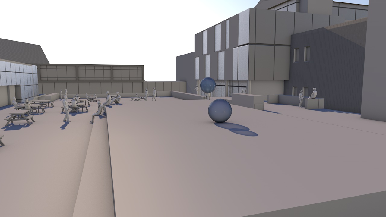
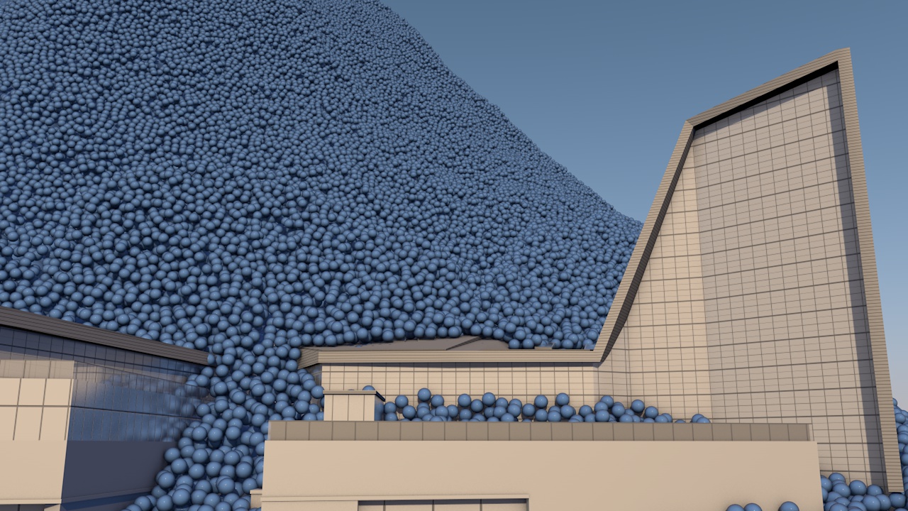
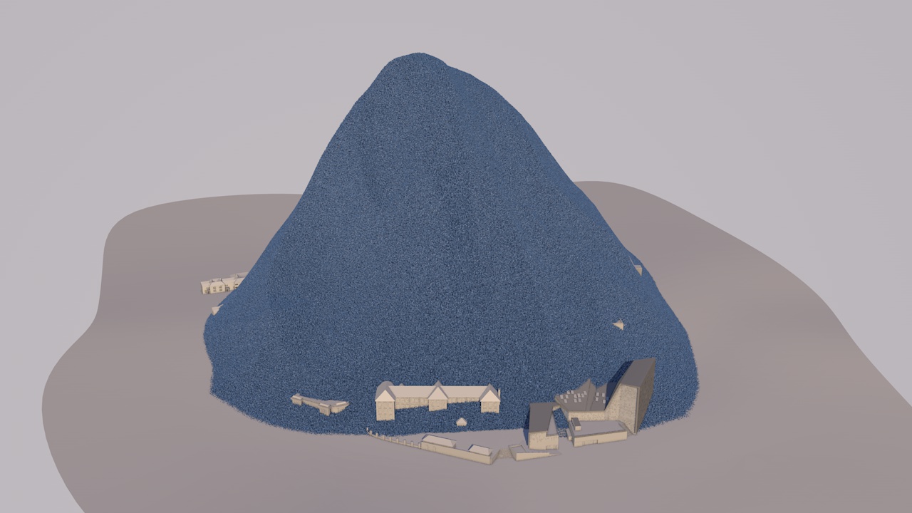
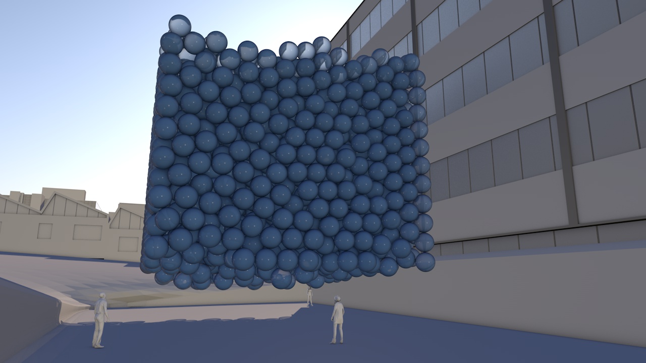
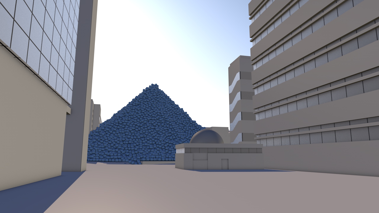
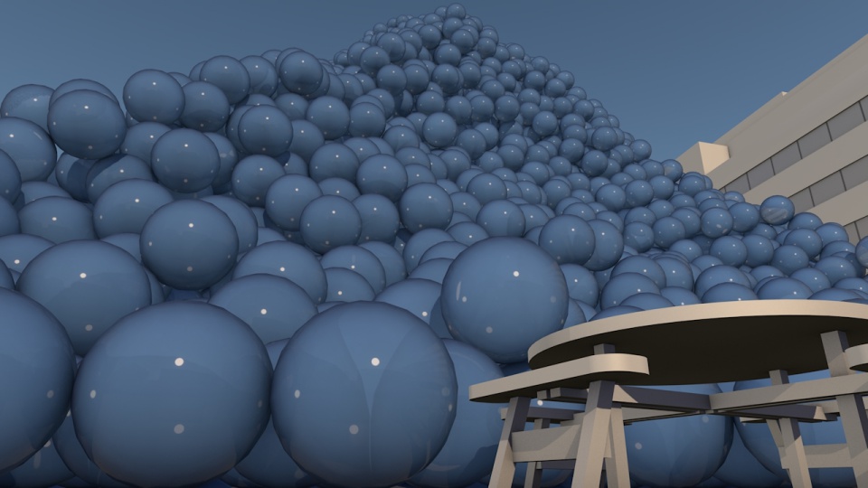
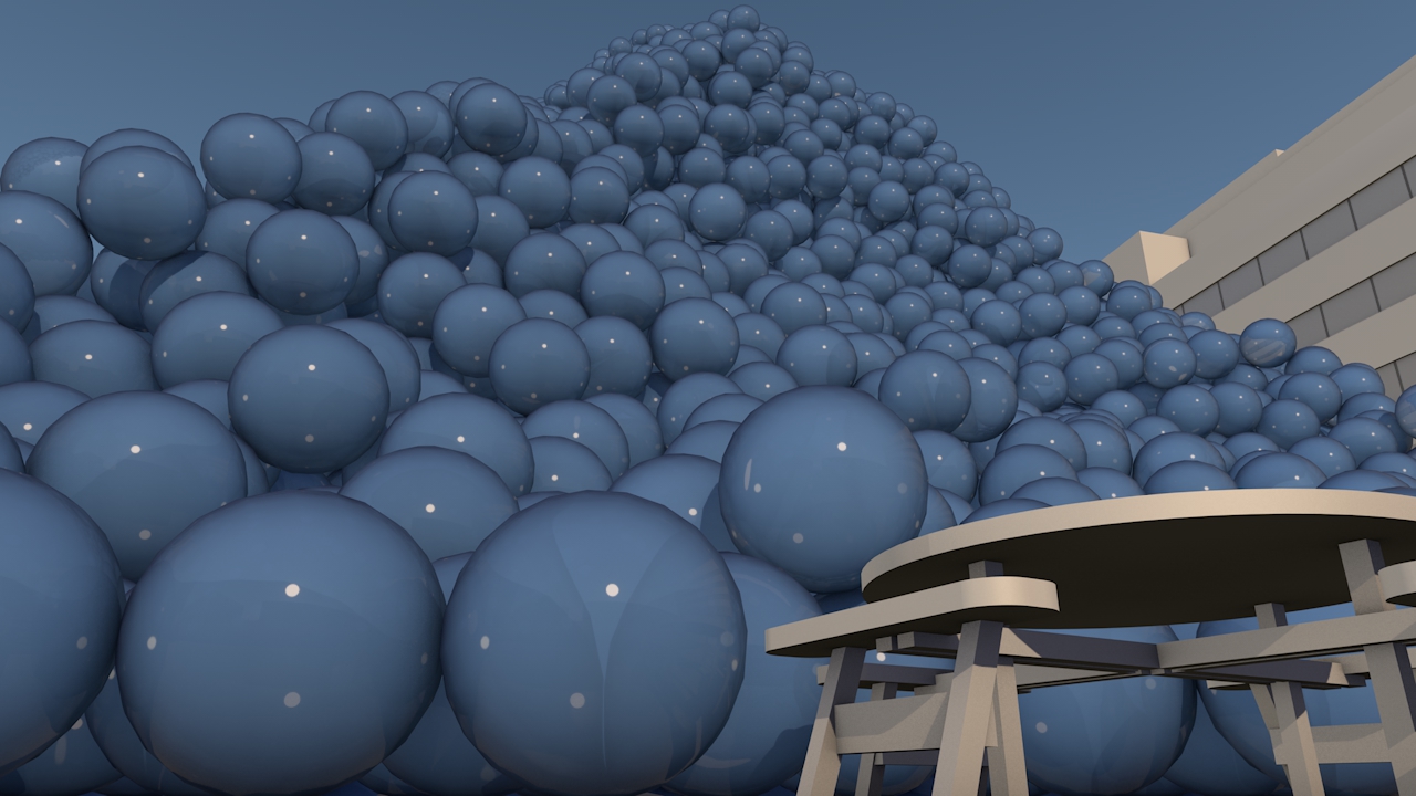
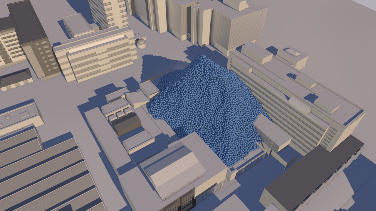
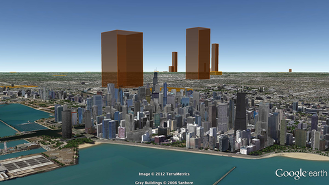
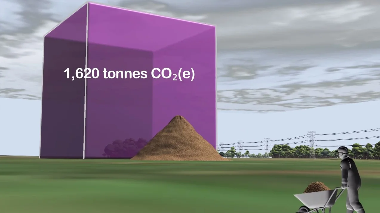
A short animation showing Ireland’s daily emissions as a large pile of one tonne carbon dioxide bubbles beside the Poolbeg towers in Dublin bay.

How do you show the carbon footprint of a country? That was the task set by Ireland's Environmental Protection Agency (EPA). The EPA compiles Ireland's annual greenhouse gas emission inventories and projections, which allows the Government to assess progress against key targets, report to the European Commission and UNFCCC and informs policy development and mitigation measures. The EPA also aims to provide up-to-date scientific information to a wide range of audiences, from policymakers to the general public. A simple visual would help to get more people engaged in the issue.

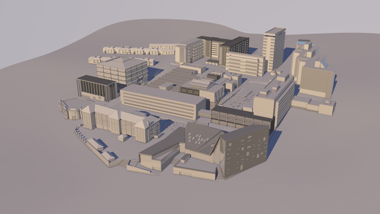
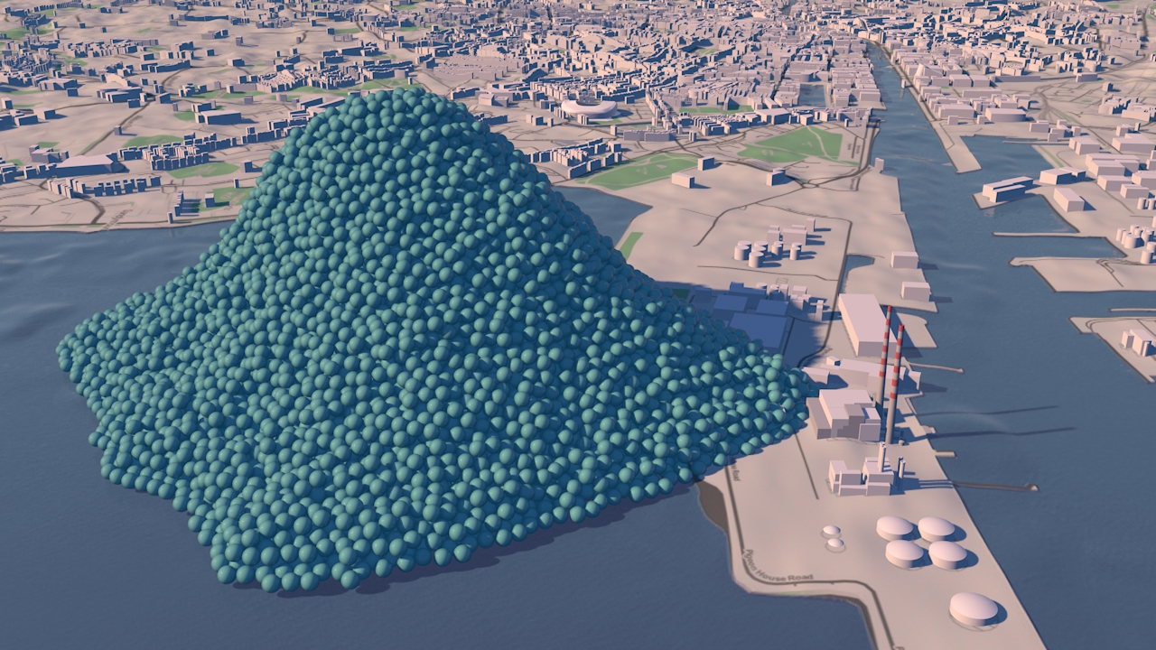
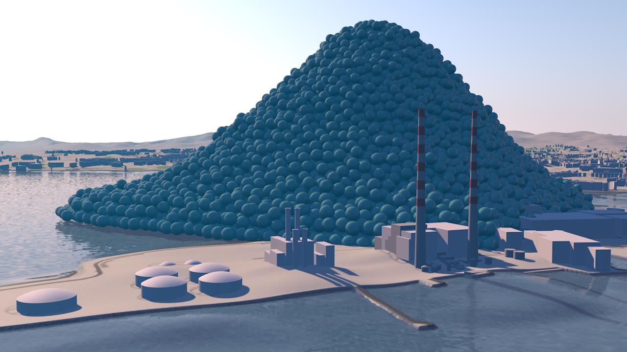
Carbon Visuals created a short animation showing the daily emissions as a large pile of one tonne carbon dioxide bubbles - sitting next to the Poolbeg towers in Dublin bay.

See the EPA webpage here.

TECHNICAL NOTE

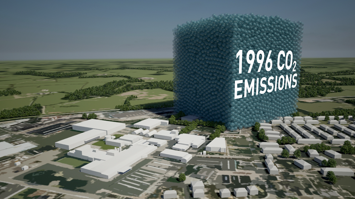
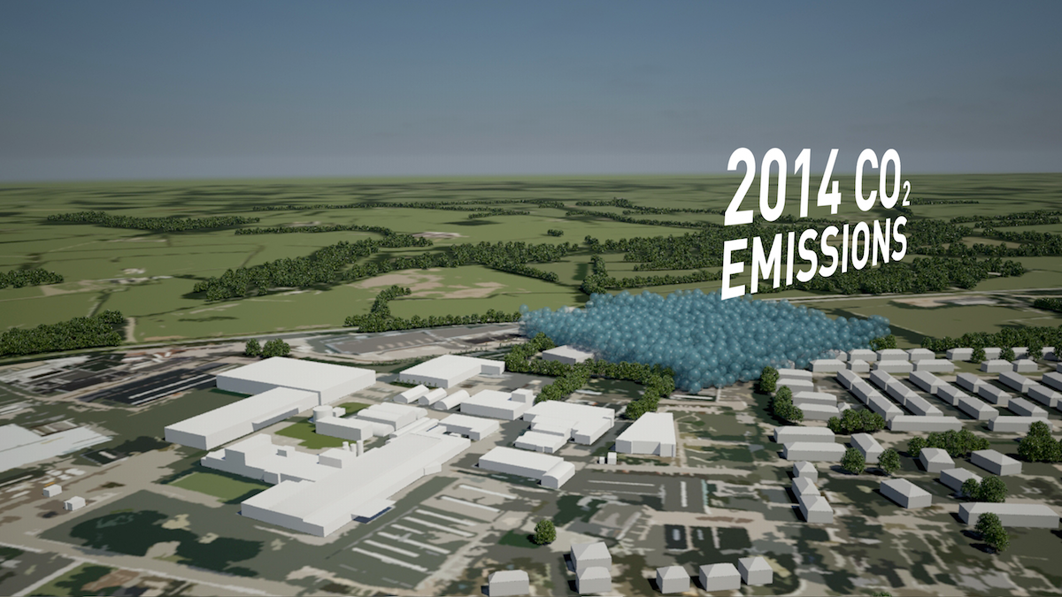
The data source for this visualisation is the EPA’s Greenhouse Gas Inventory for 2012 which calculates annual emissions from Agriculture, Energy, Transport, Industry and commercial, Residential and Waste sectors, and was released in 2014.

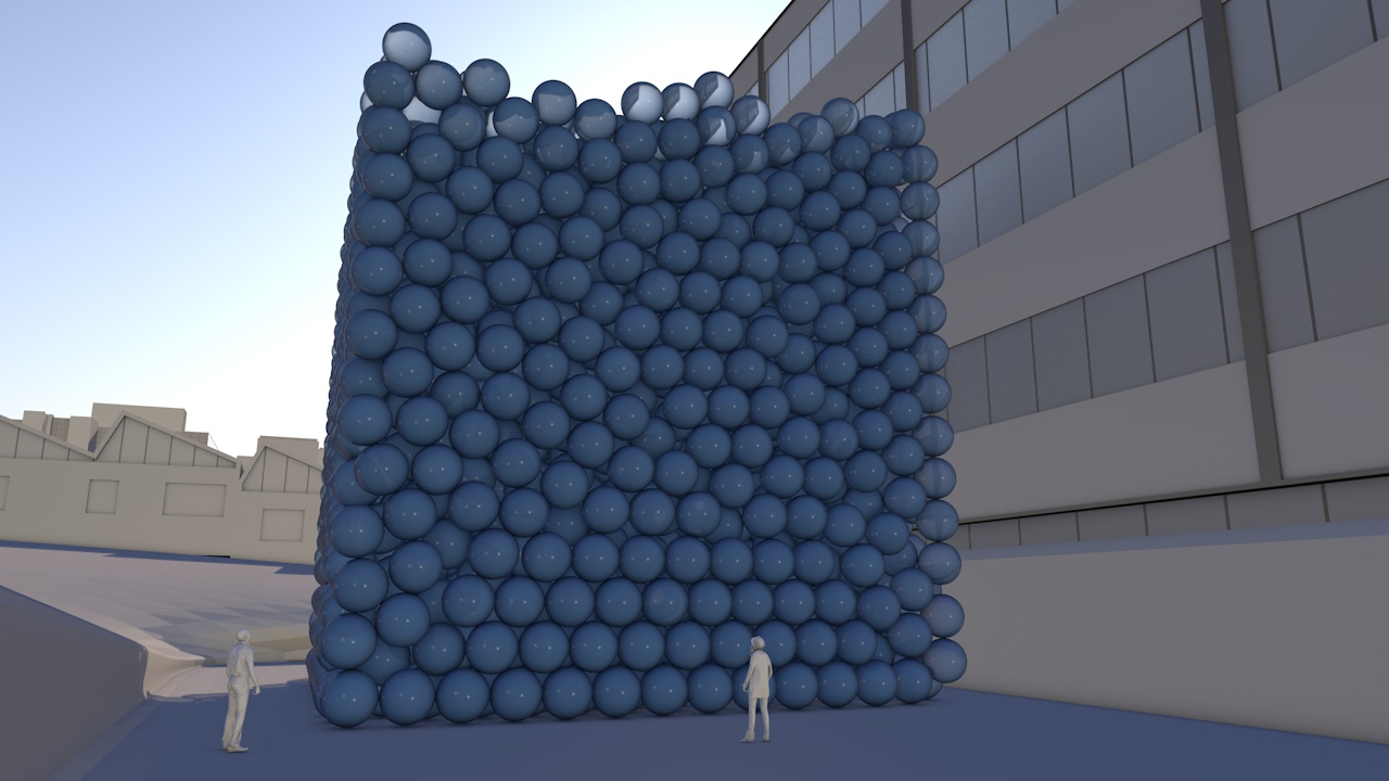
Each sphere represents one tonne of greenhouse gas as carbon dioxide equivalent - Co2(e). Greenhouse gases other than CO2 (i.e. methane, nitrous oxide and so-called F-gases) may be converted to CO2 equivalent using their global warming potentials.

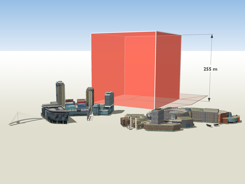
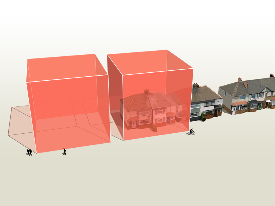
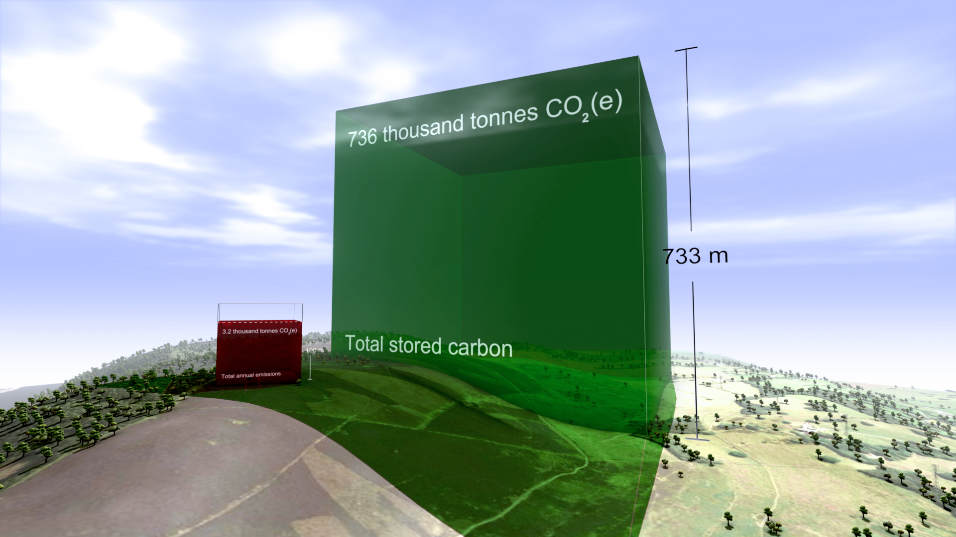
For 2012, Ireland’s total national greenhouse gas emissions are estimated to be 58,531,238 tonnes or 160,359 tonnes per day.

Carbon dioxide gas at 15 °C and standard pressure has a density of 1.87 kg/m3. At standard pressure and 15 °C a metric ton of carbon dioxide gas would fill a sphere approximately 10 metres across.  The video shows a pile of 160,359 spheres 10 metres in diameter located near the Poolbeg Towers in Dublin Bay, with the city behind.

University of Plymouth - The Carbon Footprint

CLIENT

University of Plymouth

PURPOSE

To engage students, academics and staff, show emissions are real and that the University is endeavouring to achieve reductions.

DESCRIPTION

Animation showing the footprint using the campus itself for scale and including a success story where emissions have been reduced.

The University of Plymouth adds 11 thousand tonnes of carbon dioxide to the atmosphere every year. But what does that look like?

This animated film illustrates this footprint using the campus itself for scale and shows a ‘success’ story’ where emissions have been reduced.

The purpose of the video was to engage otherwise uninterested students, academics and staff, get them to realise that carbon emissions are real and show that the university is endeavouring to achieve measurable reductions. The intention is then to invite them to explore more detail through web-based energy and carbon dashboard.

The annual carbon reduction savings of 213,890 KgCO2e were achieved at the Babbage building after lighting and IT upgrade, installing voltage optimisation and connection to the Combined Heat & Power (CHP) plant. These savings are expected to equate to the annual emissions of the new Marine Building.


FURTHER INFORMATION

University of Plymouth Carbon Management Plan 2010 - 2015 here.

Sustainability pages for Plymouth University here.


Visualising a 90% carbon reduction

CLIENT

Interface

PURPOSE

To show the 90% carbon reduction achieved since 1996 at the European manufacturing facility in the Netherlands.

DESCRIPTION

Short animation that can be used on social media together with before and after images showing the Scherpenzeel factory and surroundings with the dramatic reduction in emissions.

In the past three years we have taken huge strides towards our Mission Zero goal.
To put it in context, we are now operating our European factories with a 90% reduction in greenhouse gas emissions compared to 1996 while the EU Commission has set an EU carbon reduction target of 40% by 2030.

Rob Boogaard, CEO Interface Europe

Carbon Visuals has helped Interface, the carpet tile manufacturer and pioneer in corporate sustainability, show the impressive 90% carbon reduction achieved since 1996 at its European manufacturing facility in the Netherlands.

We created a 3D model of the Scherpenzeel factory and surrounding area and populated it with our trademark ‘carbon bubbles’. Deliverables included volumetrically accurate ‘before’ and ‘after’ images as well as a short animation that can be used on social media or as part of a longer video.

See this animation on YouTube

Interface info on achieving 90 carbon reduction

Infographic illustrating how the emissions reduction has been achieved.

Video: A better way - Interface Europe achieves 90% CO2 reduction

New York's carbon emissions - in real time

In 2010 New York City added 54 million metric tons of carbon dioxide to the atmosphere, but that number means little to most people because few of us have a sense of scale for atmospheric pollution.

Carbon Visuals, supported by Environmental Defense Fund, have created a film that makes those emissions feel more real - the total emissions and the rate of emission. Designed to engage the ‘person on the street’, this version is exploratory and still work in progress.

Visualising the carbon footprint of all US power stations

We are keen to find existing carbon emission data sets that would benefit from the Carbon Visuals treatment. So when CEO Antony Turner was invited to participate in an “Energy Data Jam” at Google's New York offices in July 2012 he was quick to accept as the aim of the event was to “…brainstorm how publicly available US datasets might be put to use in the continuing transition to a clean energy future.”

One set that we thought would benefit from ‘becoming visible’ was the eGRID data collated by the US EPA. This gives annual generation and environmental characteristics of all large electric power generators in the US.

By using our Google Earth Visualiser tool we are able to create images for any location in the US that show nearby power stations and associated data.

If you would like to explore this data using Google Earth you can download the KMZ file here.

Showing the emissions of power stations in this way is experimental, and a first step. We would welcome ideas and proposals on how this could be developed.

If you have collaboration or funding ideas please contact Carbon Visuals CEO Antony Turner.

USA specific image set

A set of simple images was created to give context to other visualisation projects we were carrying out for US-based Environmental Defense Fund.

Using a model of a typical US house, combined with US metrics - tons, gallons etc. - helps make the images more real for Americans.

Barts NHS Trust Estates Strategy

Barts Health NHS Trust was formed in 2012. It is the largest in the country with multiple sites and major projects planned and underway. For presentation of the Estate Strategy we created 3D models and a map=based animation that showed, in simplified form, development and other planned changes over a five-year period, together with data for water, gas and electricity usage.

We also provided a set of images for use in other presentation formats and media.

Visualising the greenhouse gas emissions for London’s Strategic Health Authority

Carbon Visuals was commissioned by UCLH (University College London Hospital), to create a set of images and a short animated film depicting the carbon footprint of all London's hospitals and NHS Trusts.

The visuals are used in conferences and workshops where facilities and energy personnel, as well as a wide range of other stakeholders, can get a better understanding of actual emissions, emissions reductions and the differences between different hospitals.

Real-time Energy & Carbon Displays for Devon Visitor Centre

Carbon Visuals has created real-time energy and carbon visualisation displays for a new Visitor Centre at Occombe Farm, a working organic farm that includes an award-winning farm shop, a cafe featuring local food and drink, a nature trail, an education centre and cookery workshops.

Telling the story of a city's emissions

Adam Nieman has created a series of images as part of a residency at the Create Centre, Bristol, April-June 2012. The exhibition coincided with Bristol's Big Green Week, an annual event that engages the public in green issues and actions.

The carbon footprint of one hour's TV production

CLIENT

BBC

PURPOSE

To illustrate the emissions resulting from TV production for an industry conference at White City.

DESCRIPTION

Animation that shows the real-time emissions associated with making one hour of broadcast ready production, and image set.

The television industry is taking steps towards addressing sustainability issues associated with TV productions. A key tool, created by the BBC and made available through a partnership with BAFTA, is Albert - a bespoke carbon calculator.

Carbon Visuals was commissioned by the BBC to produce a set of images and a real-time animation showing the emissions resulting from one hour of TV programming. The data was provided by about 80 productions that were the first to use the Albert calculator at the BBC.

This animation was created for the BBC and shows the real-time emissions associated with making one hour of broadcast ready production - equivalent to about 8.2 tonnes of carbon dioxide.

Average emissions associated with the major stages of a production are here shown in order of size and as a whole, depicted in front of the BBC White City building.

These visuals were first shown at an industry conference, which took place in the iconic BBC White City building that is depicted here, on 3rd November 2011.

The PDF illustrates the emissions of different parts of the production process.

Albert was developed & trialed within the BBC in 2011, with production managers and coordinators providing data on about 80 programmes. While there were considerable variations between productions, the average (mean) rate - about 8.2 tonnes of carbon dioxide per hour - provides a first attempt at establishing a figure against which programme makers will be able to gauge progress in future.

Annually within the BBC, about 3,800 hours of TV are produced in-house. An annual volume of emissions, based on the average rate per production hour for programme emissions calculated using Albert, is here shown with familiar BBC buildings in Salford and London for scale.

The average (mean) rate of emissions associated with TV production, based on data from about 80 programmes, is about 8.2 tonnes of carbon dioxide per hour.

This is roughly equivalent to the annual emissions associated with space heating, heating and lighting for a pair of semi-detached houses (figures provided by the BBC).

Based on the average rate per production hour for programme emissions, 11 hours of production time would fill the void in the centre of the BBC Television Centre in London - a space that is well-known to production teams.

Illustrating carbon reduction potential for South Kensington 1851 Estate

CLIENT

Natural History Museum, Science Museum, V&A, Imperial College and Royal Albert Hall

PURPOSE

To illustrate the carbon reduction potential for the South Kensington 1851 Estate.

DESCRIPTION

Striking image set, to illustrate the Carbon Reduction Masterplan launched by the Minister of State for Energy and Climate Change.

Carbon Visuals has created a set of striking images to illustrate the carbon reduction potential for the South Kensington 1851 Estate. Organisations involved include the Natural History Museum, the Science Museum, the Victoria and Albert Museum, Imperial College, the Royal Albert Hall, the Royal College of Music and the Royal College of Arts.

These prestigious institutions came together in 2005 to embark on an inspirational long-term carbon reduction plan. Phase One involved laying the foundations and creating a realistic strategy. The Masterplan, launched in November 2011, marks the conclusion of that phase and the commencement of its realisation.

Carbon Visuals aided communication amongst the parties and with external stakeholders by creating striking imagese at various stages of the project.

Creating a computer generated model of the Estate enabled a wide range of different images to be created - wide angle, close-up, aerial and ground level.

To see the context in which the images were used feel free to download the PDF of the overview brochure.

Carbon footprint of 40,000 UK public buildings


Carbon visuals specialises in providing a ‘feel’ for carbon data. Initially we focused on single statistics and small data-sets. Now we can use the same techniques to provide a sense of scale for tens of thousands of carbon footprints at the same time.

With a grant from the UK’s Technology Strategy Board we have been exploring real-time visualisation and the visualisation of large data-sets. One of the results is an interactive visualisation of the carbon footprint of every public building in England and Wales – 40 thousand of them!

http://uk-energy-ratings.carbonvisuals.com/ The visualisation works in any browser that can run the Google Earth plugin but because the dataset is large, the plugin may perform sluggishly on slow computers.

Or open in desktop version of Google Earth: http://uk-energy-ratings.carbonvisuals.com/kml/uk-emissions.kml

The visualisation uses a database of UK Display Energy Certificates – the energy ratings that all public buildings must display. Once we had geocoded these we displayed the buildings’ carbon footprint in 3D in Google Earth as actual volumes of carbon dioxide gas at the location of the building itself.

We can display the daily footprint as well as the annual footprint because a day’s emissions are sometimes easier to relate to activity. We can also display the footprint with reference to the floor-area of the building itself. Wide short footprints indicate buildings with smaller emissions per square metre than narrow tall footprints.

This application uses data obtained from the Department for Communities and Local Government by the Centre for Sustainable Energy.www.cse.org.uk/pages/resources/open-data

The visualisation works in a number of ways. It allows comparison with other comparable buildings at the same time as providing a sense of scale of emissions from buildings as a whole. Most importantly, it uses the world itself as part of its own explanation. Our familiarity with the real world – with buildings we work in and cities we travel through – is an underused resource in data visualisation. With Google Earth we can put that experience to work.

We can use the same techniques for any geocoded emissions data and create visualisations that can be explored interactively in Google Earth on the desktop or the web. We can also create stand-alone fly-through animations that present the data efficiently to any non-technical audience.

Bird's eye view of Westminster

The carbon footprint of the UK potato

CLIENT

ADAS

PURPOSE

To illustrate their capability to help farmers manage and reduce emissions.

DESCRIPTION

Film that combines live action and animation to explore the carbon footprint of the UK potato at personal and farm scales.

ADAS, the land and farming consultancy, wanted to compliment the earlier film that we made to illustrate emissions, sequestration & stored carbon on upland farms in the Peak District National Park. This time they were keen to illustrate their capabilities in helping mainstream farmers manage and reduce their carbon emissions.

The film explores the carbon footprint of the UK potato at the personal scale, as well as carbon saving potential at the farm scale.

More info from ADAS Carbon Management Team

To see all our work for ADAS, click here.

Carbon Visuals is keen to explore the use of film for helping everyone better understand carbon emissions from everyday activities. Please contact us if you have ideas.


Supporting BP's interactive carbon calculator for motorists


CLIENT

BP

PURPOSE

To encourage motorists reduce emissions from driving.

DESCRIPTION

Consultancy and visuals for a web calculator showing actual volumes of CO2 which change in size as reduction actions are chosen, with image set and methodology.

Carbon Visuals helped newly re-launched BP Target Neutral project by providing consultancy for the web calculator designed to help motorists reduce, replace and offset carbon dioxide from driving. The calculator, aimed at the general public, is the first in the world to show actual volumes of CO2 which change in size as different reduction actions are chosen. In addition carbon spheres can be compared against averages for other countries as well as the UK 'target' reduction for 2050.

We also provided a number of bespoke images to highlight transport emissions in the UK, emissions of different transport types as well as transport emissions per capita for different countries.

Our Creative Director, Dr Adam Nieman also provided an overview of the importance of carbon visualisation

The first visual image uses Spaghetti Junction on the M6 near Birmingham as this basic ground. The familiar image from the British road network makes the immediate point that this is about roads, but then uses the recognisable scale to locate a cube-like shape showing the volume of carbon our cars, lorries and buses put into the atmosphere every day.

The cube presents this visually, while the simple captions fill in the specific details. This, the image is saying, is what 90,000 tonnes of carbon dioxide look like, and that’s what we’re pumping into the atmosphere every day. Suddenly the daily figure is something real and dramatic.

The BP Target Neutral Methodology PDF outlines the data, calculations and assumptions in the image set.


UK Government departments exceed their 10% CO2 reduction targets


Carbon Visuals was commissioned by DECC to produce a set of high-resolution Google Earth images to illustrate Government department carbon footprints and reduction targets. The total carbon dioxide emissions between May 2010 and May 2011 amounted to 646,231 tonnes, which is 13.8% less than the previous year. This is what that looks like.

The actual volume of carbon dioxide gas emitted by the UK Government in 2010/11 (red volume). The saving on 2009/10 - the gas that didn't enter the atmosphere - is shown as the dashed volume. The target is shown as a red band.

See the Government press release here:www.decc.gov.uk/en/content/cms/news/pn11059/pn11059.aspx

Download the PDF with more info

Bringing the Royal College of Music carbon management plan to life


The Royal College of Music worked with the Carbon Trust to develop a Carbon Management Plan, which was published in July 2010. The Plan highlighted a number of actions that could be taken to reduce emissions by 25% by 2013/14.

A key part of the Plan was to get students and staff engaged in the issues, so Carbon Visuals were invited to find innovative ways to communicate the carbon footprint and emissions reduction targets.

It was a very worth while project and has been a well recieved way of getting this difficult message across

Matthew Nicholl, Building Project Manager, Royal College of Music

To turn abstract numbers into quantities that viewers could relate to physically, we used a depiction of the College building. We also proposed a way for musicians in particular to gauge a 25% reduction – it’s like losing nearly two octaves from a piano.

Some of these images are being used for posters, leaflets and presentations to help staff and students have a better understanding of their carbon footprint and create ‘ownership’ of reduction plans and targets.


Emissions, sequestration & stored carbon on upland farms

Carbon Visuals have created this short animation film to show the emissions, sequestration & stored carbon on ten upland farms in the Peak District National Park. The farms extend over 1,500 hectares and comprise part moorland, part pasture.

The data was taken from ADAS Report Environmental Quality Mark (EQM) Farm Carbon Footprint and Water Audit Pilot Project.

The core message from the film is that these farms are not only producing food and preserving the landscape. They are performing an important role as guardians of a huge carbon store that is best kept in soils and vegetation.

We believe that this is a 'world first' for this type of medium. Created for the consultancy ADAS, the film demonstrates the potential for moving animation to communicate complex carbon stories.

The film is being used to engage a variety of stakeholders including ADAS staff, farm managers and agricultural policymakers.

To see all our work for ADAS, click here.

If you like this approach, and feel that it would suit your particular carbon communication challenge, then please contact us.