CLIENT
United Nations Environment Programme
PURPOSE
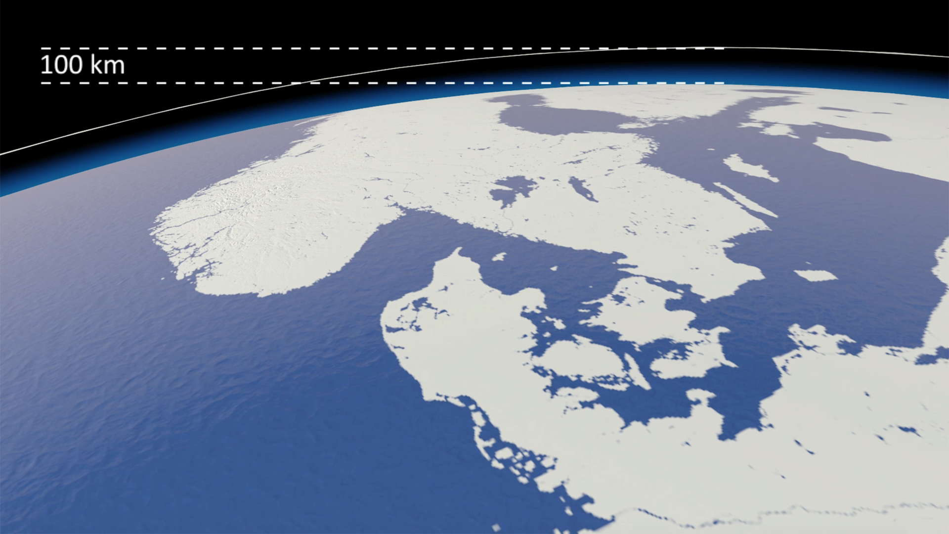
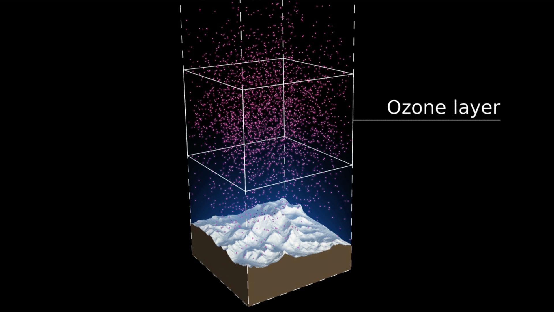
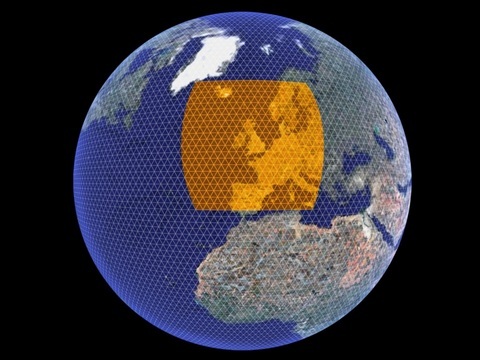
To communicate and celebrate 30 years of international effort in protecting the ozone layer.
DESCRIPTION
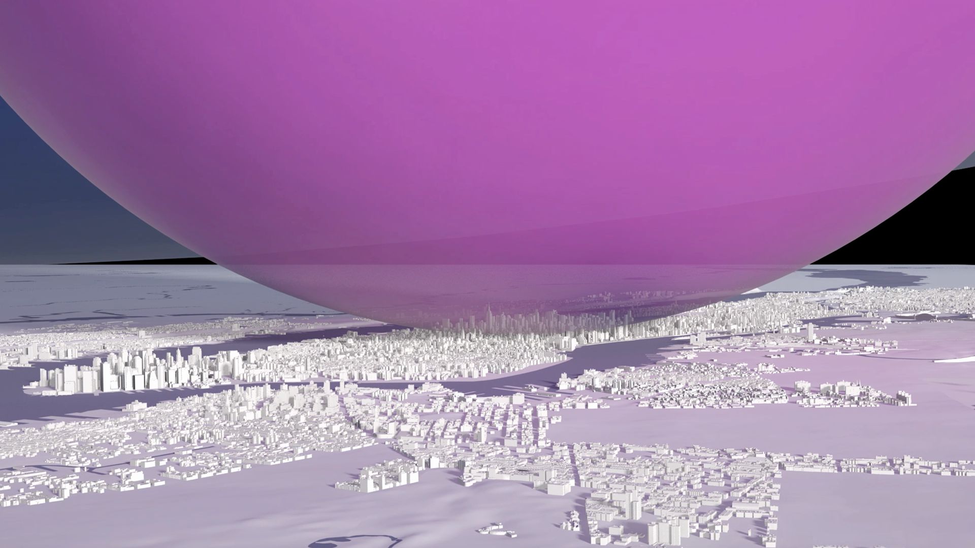
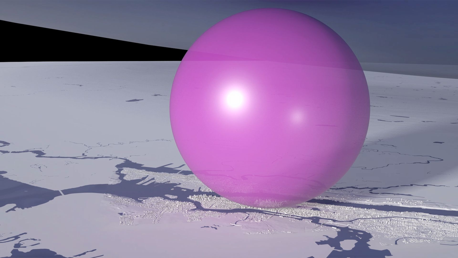
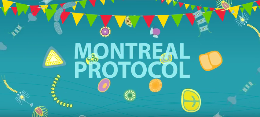
A playful musical animation showing phytoplankton celebrating the 30th anniversary of the Vienna Convention with an underwater birthday party.
It is really NICE! Thanks to the team.
Tina Birmpili, Executive Secretary, Ozone Secretariat, UNEP

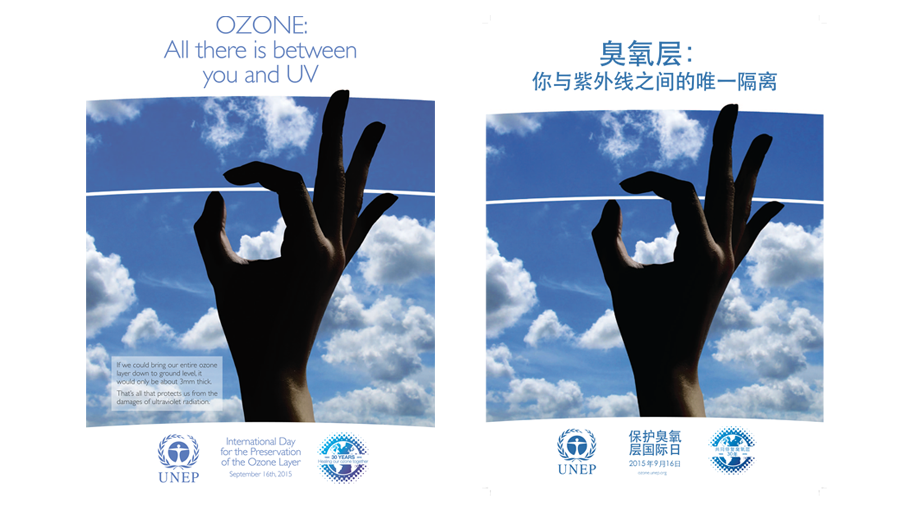
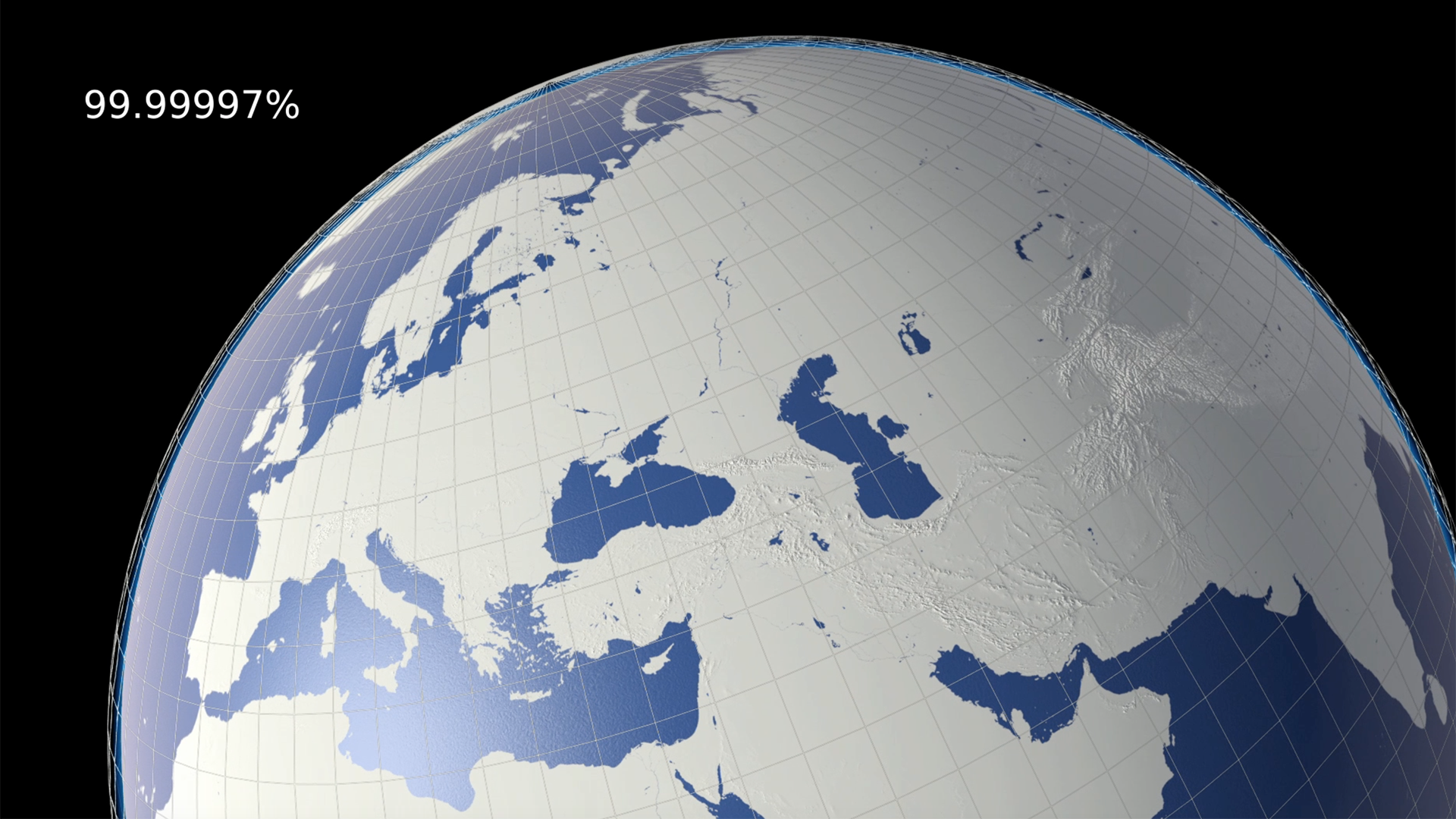
Carbon Visuals is known for accurate scientific imagery of invisible gases and environmental challenges. Providing a suite of material for the UN Ozone communications campaign gave us an opportunity to do something a little different.
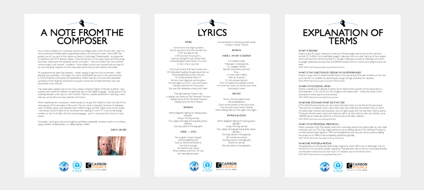
So we decided to commission a choral piece from science song composer David Haines. And we created a simple animation and education pack to help schools and children around the world take advantage of this useful learning resource. The education pack contains the lyrics for the song, a note from the composer and an explanation of some of the terms used.
Composer David Haines rehearsing the Ozone Song with children from Ford Primary School in Plymouth. They will be performing the song in front of the giant fish tanks at the National Marine Aquarium on International Ozone Day (16/09/2015).

BBC filming performance of Ozone Song at National Aquarium with children from Ford Primary School, Plymouth and choir from South Devon Singers.
I liked the idea of an underwater party of tiny creatures celebrating the success of the Montreal Protocol. Why should planetary healing just be celebrated by humans?
Antony Turner, CEO, Carbon Visuals
You can download the sheet music here: with piano or melody line only. If you are involved with a performance of the song, we'd love to see, so please upload your videos to our facebook page!
As an artist-in-residence in numerous schools and colleges both in the UK and USA, I have run many hundreds of collaborative songwriting sessions over the last twenty-five years. Since 2007, the greater part of my work of this nature has been in Cambridge, Massachusetts - as songwriter- in-residence with MIT’s Science Festival. Over the last four or five years, nearly all of the songs have been based upon the students’ science curriculum.
David Haines
The Ozone Song is also available with Spanish subtitles.