Nine minute overview of the importance of making greenhouse gases visible. Presentation from Carbon Visuals CEO Antony Turner at TEDx event in Exeter, UK, April 2012.
Supporting carbon literacy at Plymouth University
Carbon Visuals was invited to provide a set of images to illustrate the daily and annual carbon footprint of greenhouse gas emissions from selected buildings on the University of Plymouth campus.
The purpose of the project was to support carbon and energy-reduction activities by staff from the Estates Department. In addition the University is planning research to determine the effectiveness of this kind of communication with students, academics and staff.
The carbon footprint of one hour's TV production
CLIENT
BBC
PURPOSE
To illustrate the emissions resulting from TV production for an industry conference at White City.
DESCRIPTION
Animation that shows the real-time emissions associated with making one hour of broadcast ready production, and image set.
The television industry is taking steps towards addressing sustainability issues associated with TV productions. A key tool, created by the BBC and made available through a partnership with BAFTA, is Albert - a bespoke carbon calculator.
Carbon Visuals was commissioned by the BBC to produce a set of images and a real-time animation showing the emissions resulting from one hour of TV programming. The data was provided by about 80 productions that were the first to use the Albert calculator at the BBC.
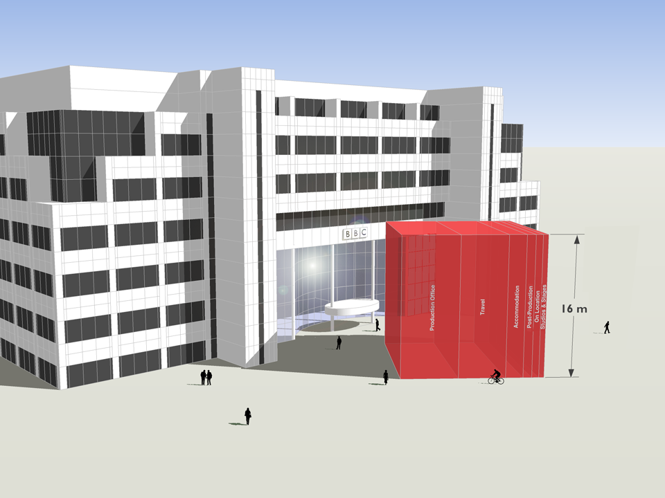
This animation was created for the BBC and shows the real-time emissions associated with making one hour of broadcast ready production - equivalent to about 8.2 tonnes of carbon dioxide.
Average emissions associated with the major stages of a production are here shown in order of size and as a whole, depicted in front of the BBC White City building.
These visuals were first shown at an industry conference, which took place in the iconic BBC White City building that is depicted here, on 3rd November 2011.
The PDF illustrates the emissions of different parts of the production process.
Albert was developed & trialed within the BBC in 2011, with production managers and coordinators providing data on about 80 programmes. While there were considerable variations between productions, the average (mean) rate - about 8.2 tonnes of carbon dioxide per hour - provides a first attempt at establishing a figure against which programme makers will be able to gauge progress in future.
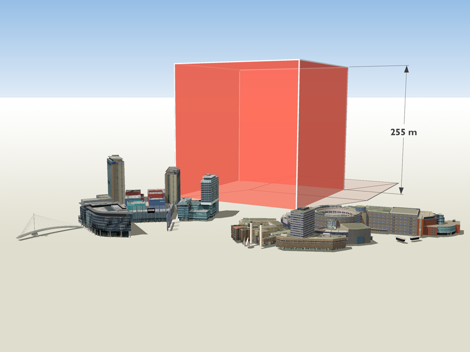
Annually within the BBC, about 3,800 hours of TV are produced in-house. An annual volume of emissions, based on the average rate per production hour for programme emissions calculated using Albert, is here shown with familiar BBC buildings in Salford and London for scale.
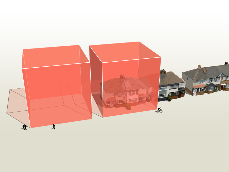
The average (mean) rate of emissions associated with TV production, based on data from about 80 programmes, is about 8.2 tonnes of carbon dioxide per hour.
This is roughly equivalent to the annual emissions associated with space heating, heating and lighting for a pair of semi-detached houses (figures provided by the BBC).
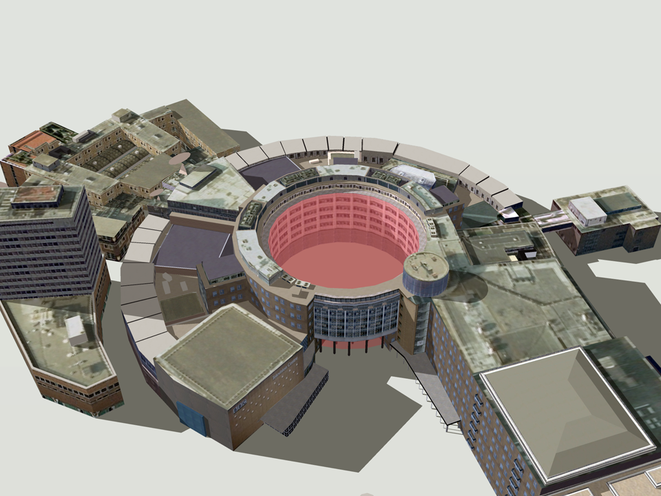
Based on the average rate per production hour for programme emissions, 11 hours of production time would fill the void in the centre of the BBC Television Centre in London - a space that is well-known to production teams.
Carbon footprint of 40,000 UK public buildings
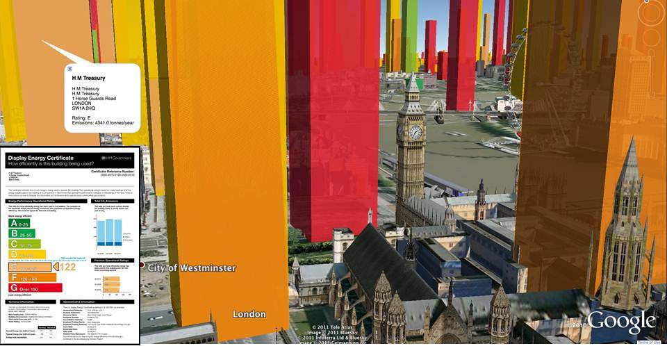
Carbon visuals specialises in providing a ‘feel’ for carbon data. Initially we focused on single statistics and small data-sets. Now we can use the same techniques to provide a sense of scale for tens of thousands of carbon footprints at the same time.
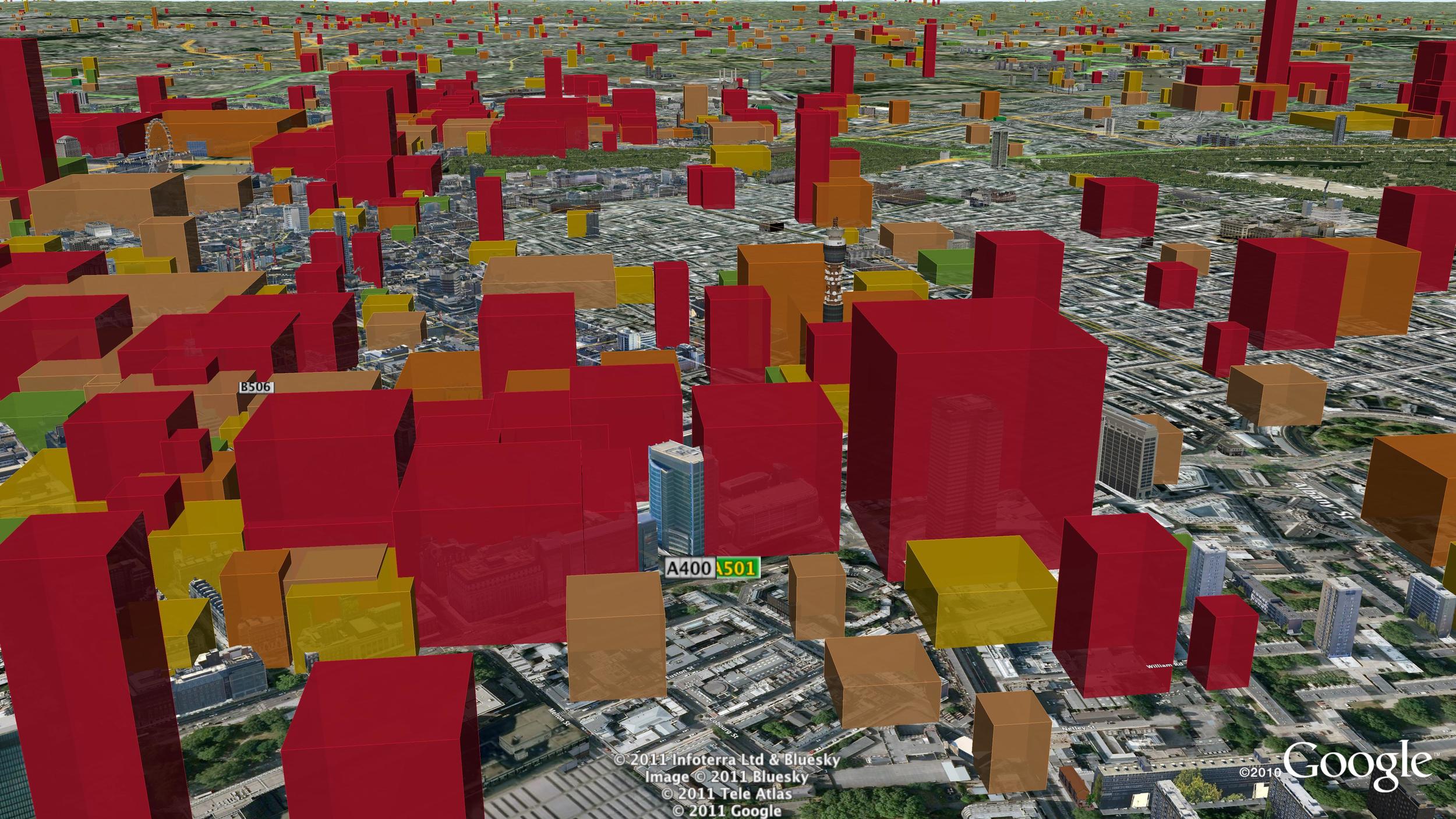
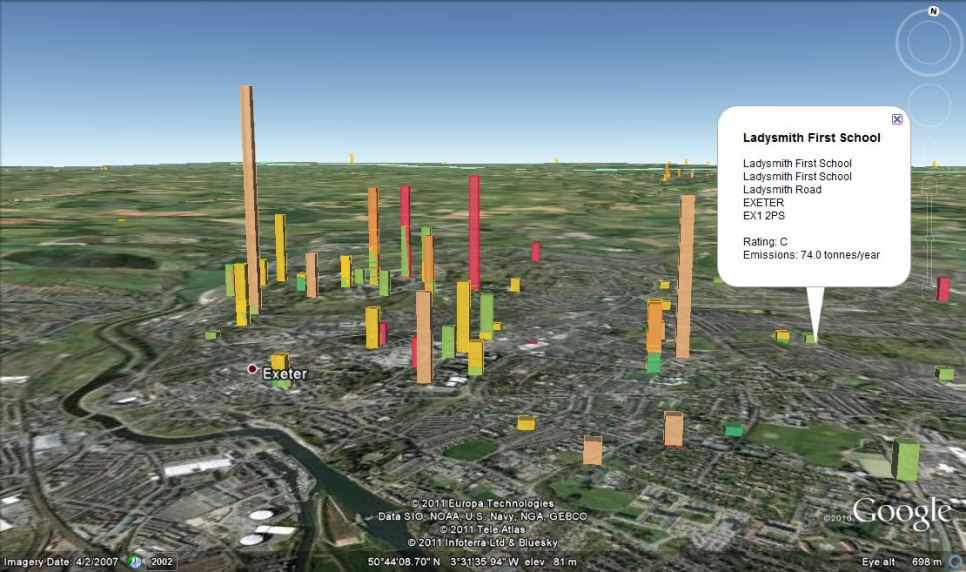
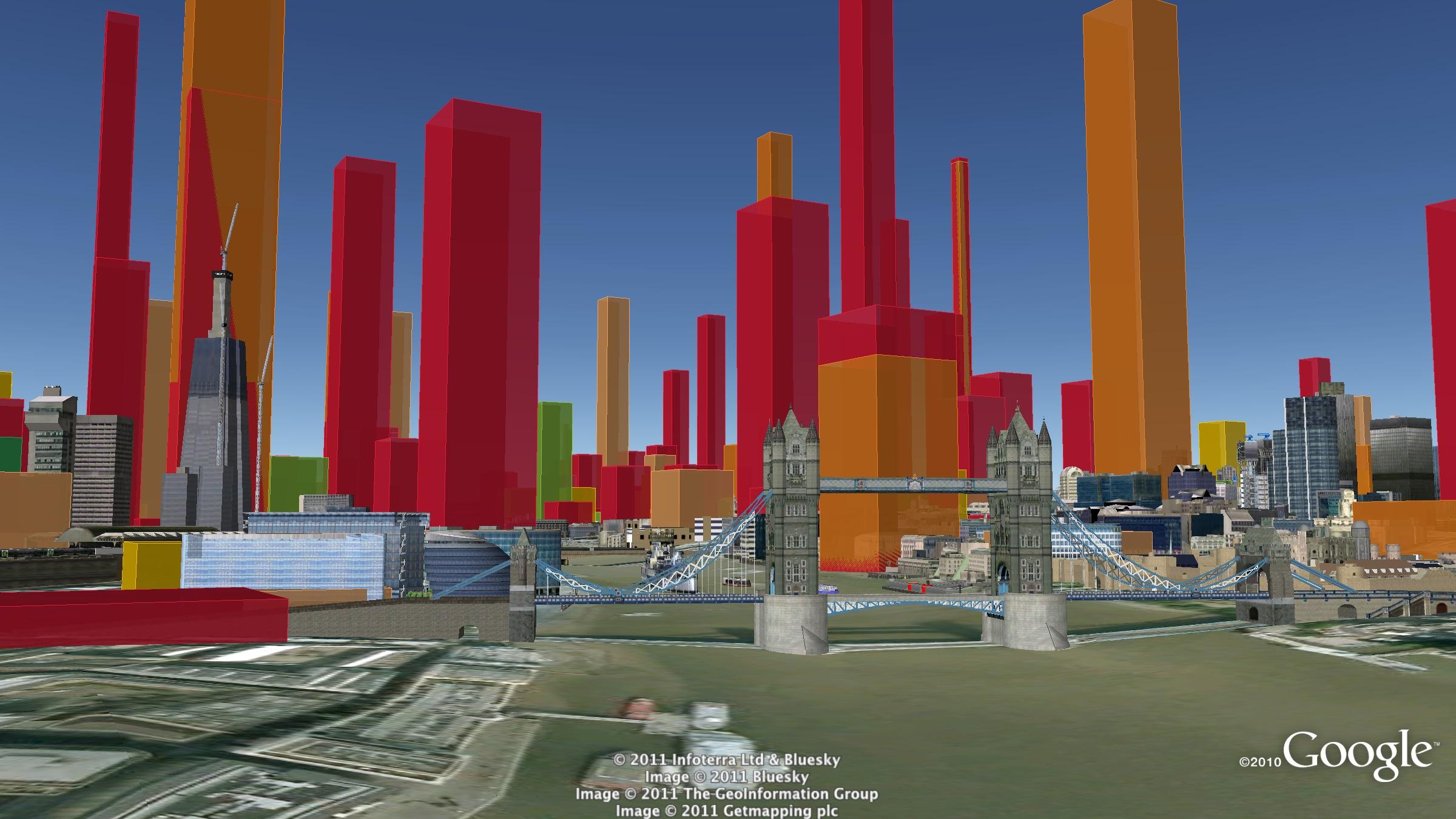
With a grant from the UK’s Technology Strategy Board we have been exploring real-time visualisation and the visualisation of large data-sets. One of the results is an interactive visualisation of the carbon footprint of every public building in England and Wales – 40 thousand of them!
http://uk-energy-ratings.carbonvisuals.com/ The visualisation works in any browser that can run the Google Earth plugin but because the dataset is large, the plugin may perform sluggishly on slow computers.
Or open in desktop version of Google Earth: http://uk-energy-ratings.carbonvisuals.com/kml/uk-emissions.kml
The visualisation uses a database of UK Display Energy Certificates – the energy ratings that all public buildings must display. Once we had geocoded these we displayed the buildings’ carbon footprint in 3D in Google Earth as actual volumes of carbon dioxide gas at the location of the building itself.
We can display the daily footprint as well as the annual footprint because a day’s emissions are sometimes easier to relate to activity. We can also display the footprint with reference to the floor-area of the building itself. Wide short footprints indicate buildings with smaller emissions per square metre than narrow tall footprints.
This application uses data obtained from the Department for Communities and Local Government by the Centre for Sustainable Energy.www.cse.org.uk/pages/resources/open-data
The visualisation works in a number of ways. It allows comparison with other comparable buildings at the same time as providing a sense of scale of emissions from buildings as a whole. Most importantly, it uses the world itself as part of its own explanation. Our familiarity with the real world – with buildings we work in and cities we travel through – is an underused resource in data visualisation. With Google Earth we can put that experience to work.
We can use the same techniques for any geocoded emissions data and create visualisations that can be explored interactively in Google Earth on the desktop or the web. We can also create stand-alone fly-through animations that present the data efficiently to any non-technical audience.

Bird's eye view of Westminster
UK Government departments exceed their 10% CO2 reduction targets
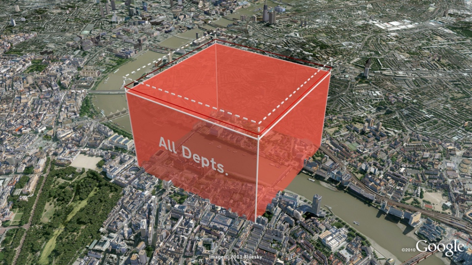
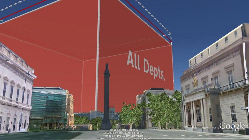
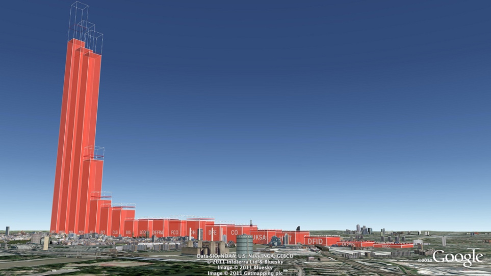
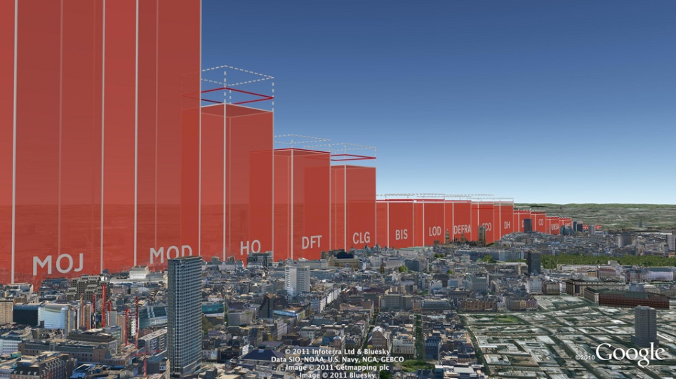
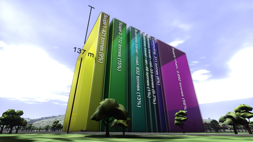
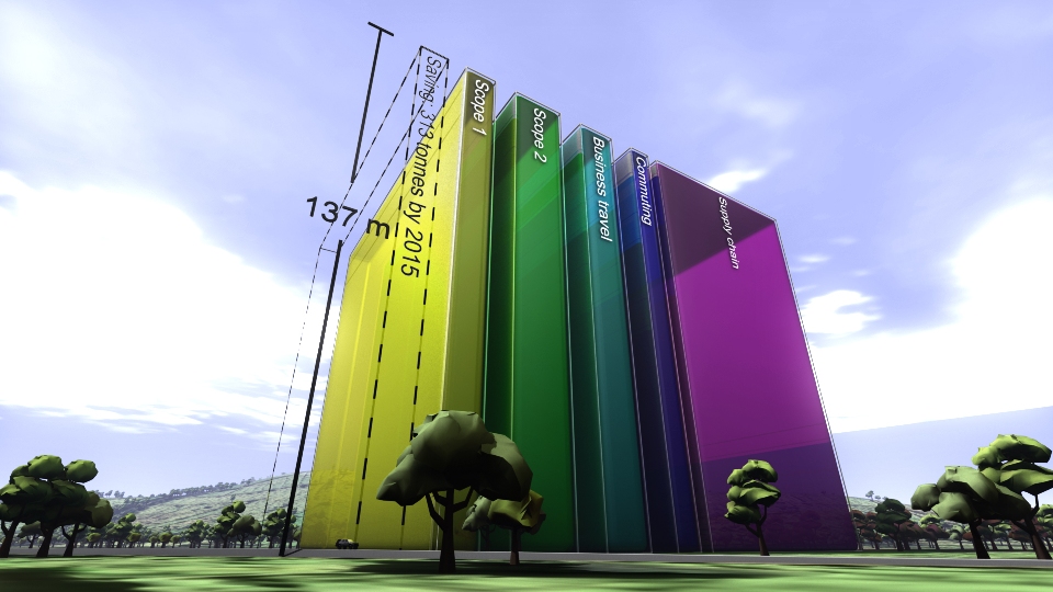
Carbon Visuals was commissioned by DECC to produce a set of high-resolution Google Earth images to illustrate Government department carbon footprints and reduction targets. The total carbon dioxide emissions between May 2010 and May 2011 amounted to 646,231 tonnes, which is 13.8% less than the previous year. This is what that looks like.
The actual volume of carbon dioxide gas emitted by the UK Government in 2010/11 (red volume). The saving on 2009/10 - the gas that didn't enter the atmosphere - is shown as the dashed volume. The target is shown as a red band.
See the Government press release here:www.decc.gov.uk/en/content/cms/news/pn11059/pn11059.aspx
Making sense of a BBC programme's carbon footprint
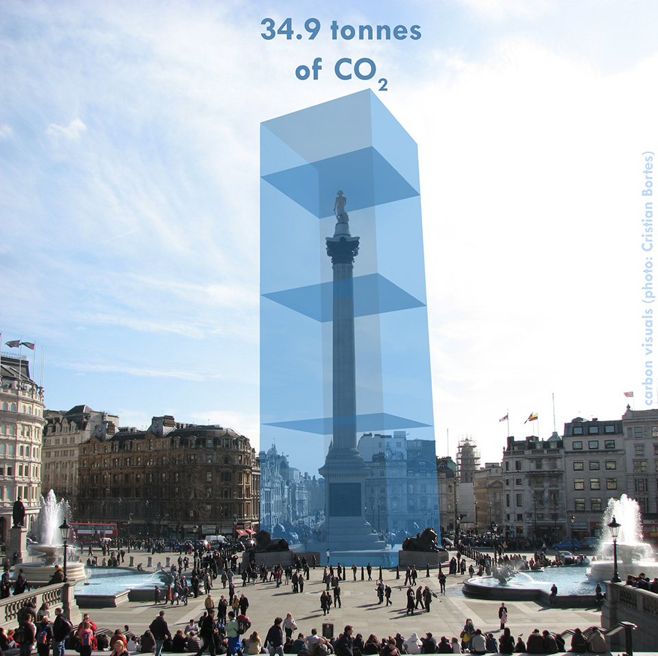
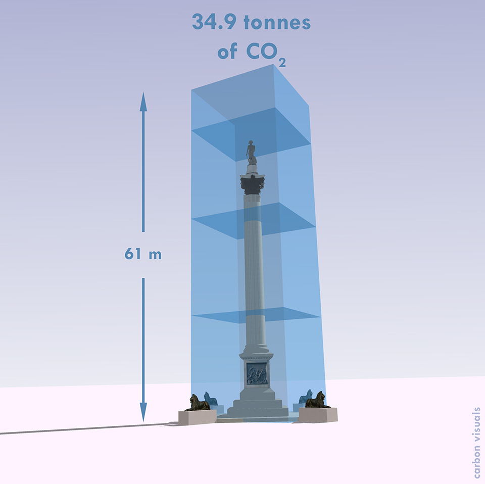
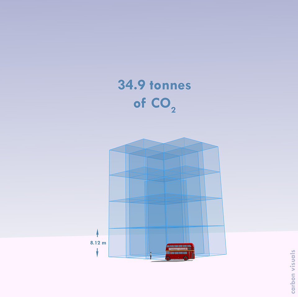
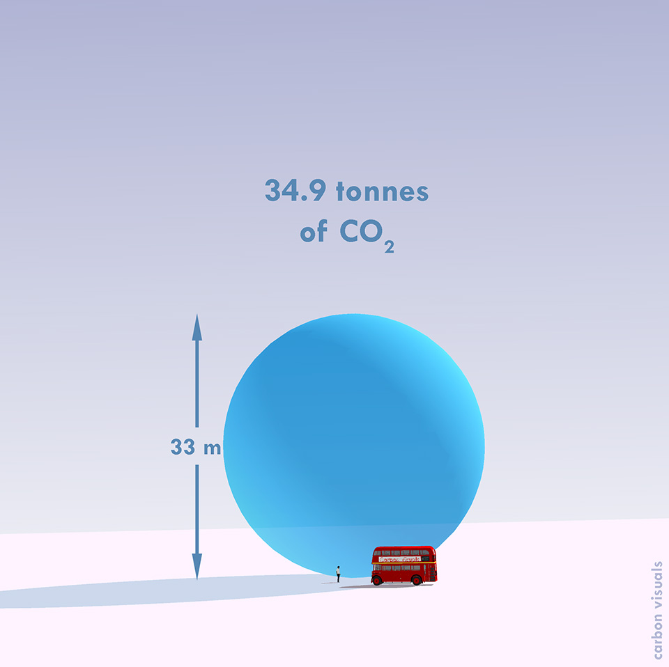
The One Planet radio programme on the BBC's World Service came to Carbon Visuals with simple question: "what does our carbon footprint look like?"
One Planet was carefully accounting for emissions arising from the making of the programme and had arrived at a figure of about 34.9 tonnes per year. But what does that mean?
Measuring carbon dioxide in terms of mass (tonnes) makes sense from an accounting point of view but doesn't give us a sense of scale we can relate to. We examined a variety of alternative ways of representing One Planet's footprint.
We have shown the programme's annual emissions by volume in a recognisable location and in relation to an iconic feature - Trafalgar Square and Nelson's Column. These provide a sense of scale that enable the viewer to relate to the volume.
You can hear a discussion about this project, first broadcast on Thursday 8 April 2010, by visiting the One Planet website.
Showcasing ADAS carbon consultancy capability
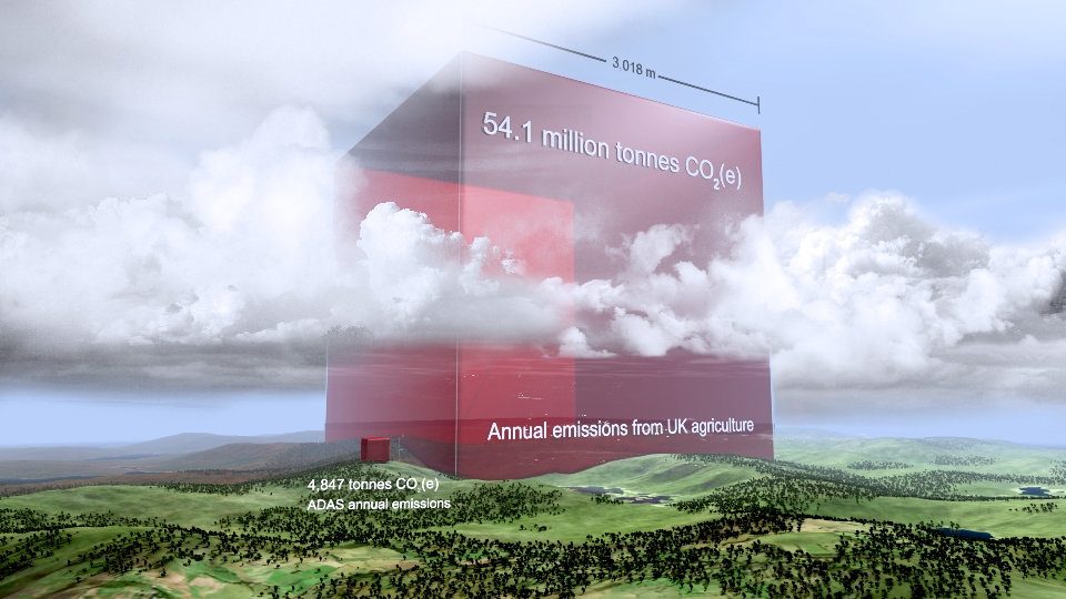
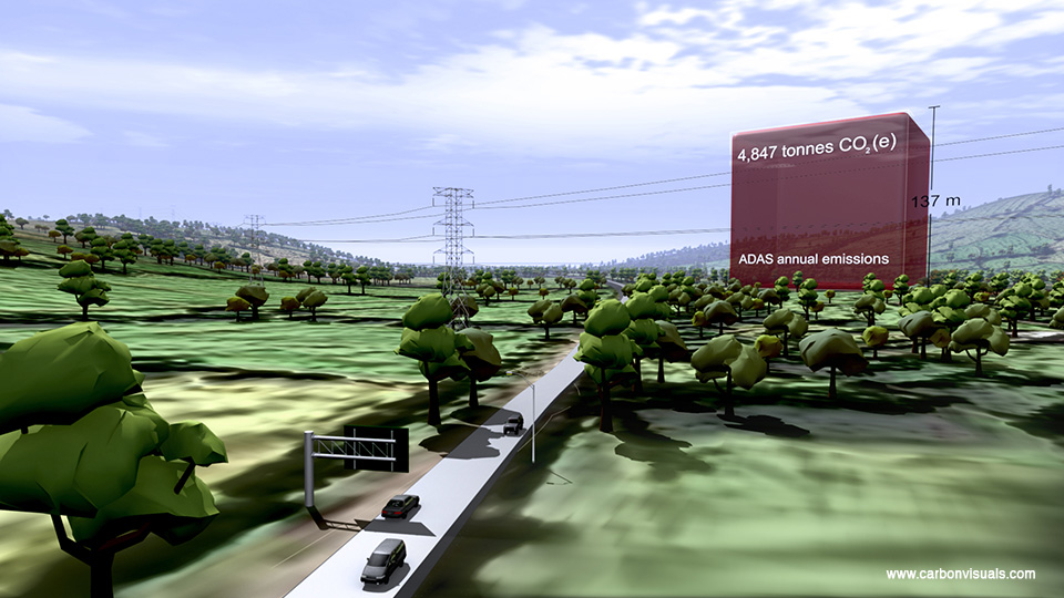
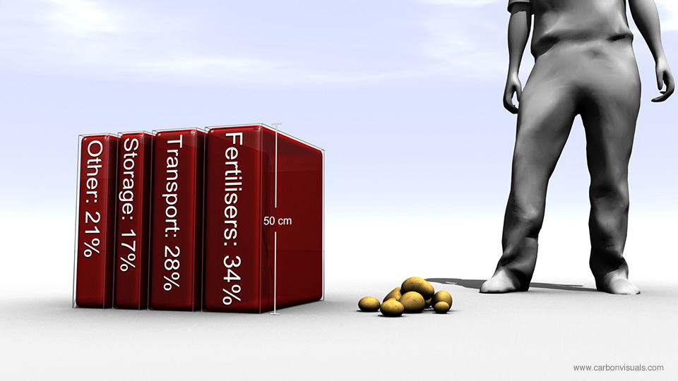
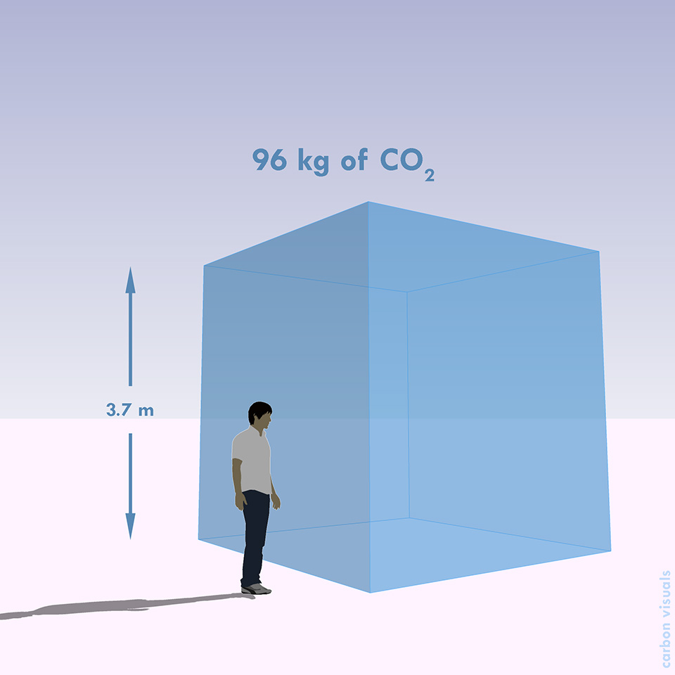
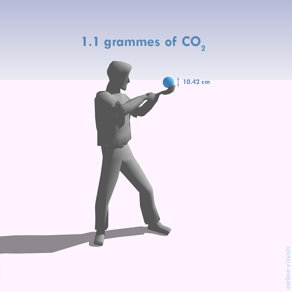
ADAS provides environmental solutions, rural development services and policy advice. The company is leading projects on GHG methodologies and mitigation measures for food production and agriculture in the UK.
For both simple and complex foods, the key is to understand the production processes of crops and animals in intensive, extensive and organic production systems.
The company asked Carbon Visuals to provide a series of images to showcase their carbon management consulting capability to the food and agriculture sector.
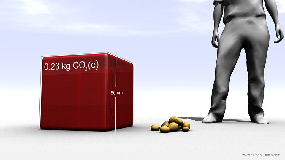
We created images depicting the carbon footprint of potatoes in relation to the production of school meals in the UK. In addition we provided an animated film showing the emissions, sequestration and stored carbon on ten Peak District farms.
Finally we produced a set of images to show the company's own carbon footprint and their reduction target. This included a comparison with the total emissions from UK agriculture - which they are able to influence through their consultancy practices.
Helping local government involve all staff in emissions reduction
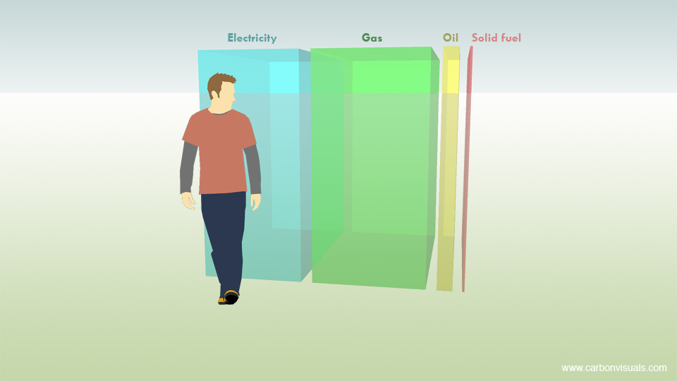
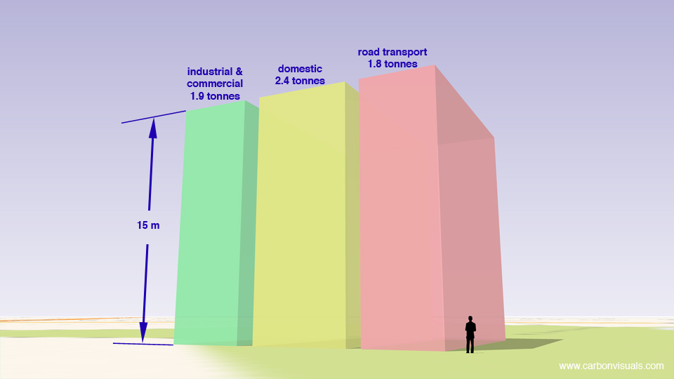

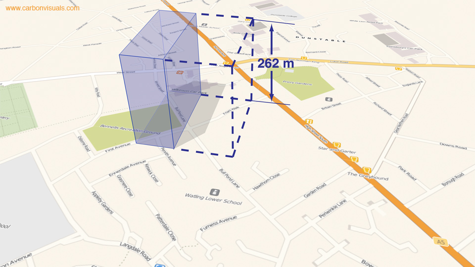
Central Bedfordshire Council needed a way to involve key stakeholders and staff in meeting targets for emissions reduction. We produced volumetric visualisations that make reference to landmarks and areas that these audiences can relate to.
We also produced animations that bring the figures to life by showing the emissions from different council activities in real-time. The Council used the visualisations in a stakeholder conference but they also found them useful for new employees, strategy documents, and the Council’s website.
These visualisations are a huge breakthrough and will enable people to clearly see the impact our carbon emissions are having on the environment and the level of responsibility that falls on each one of us to assess and change our activities.
Councillor Richard Stay, Deputy Leader, Central Bedfordshire Council