footprint

Making sense of a BBC programme's carbon footprint


The One Planet radio programme on the BBC's World Service came to Carbon Visuals with simple question: "what does our carbon footprint look like?"

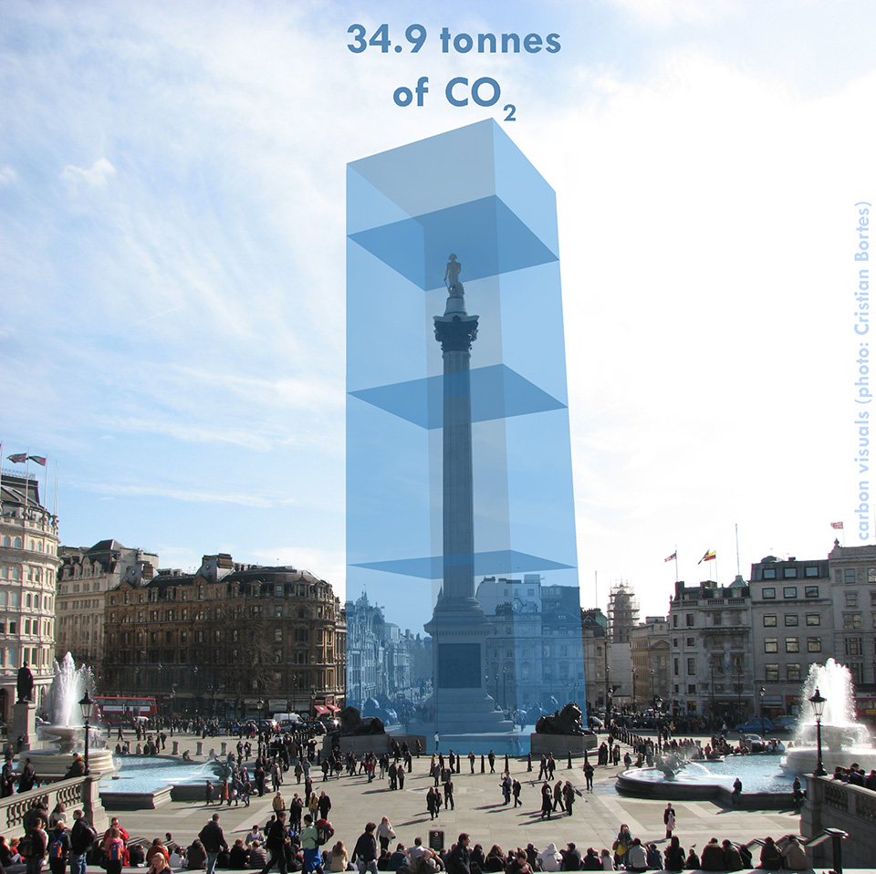
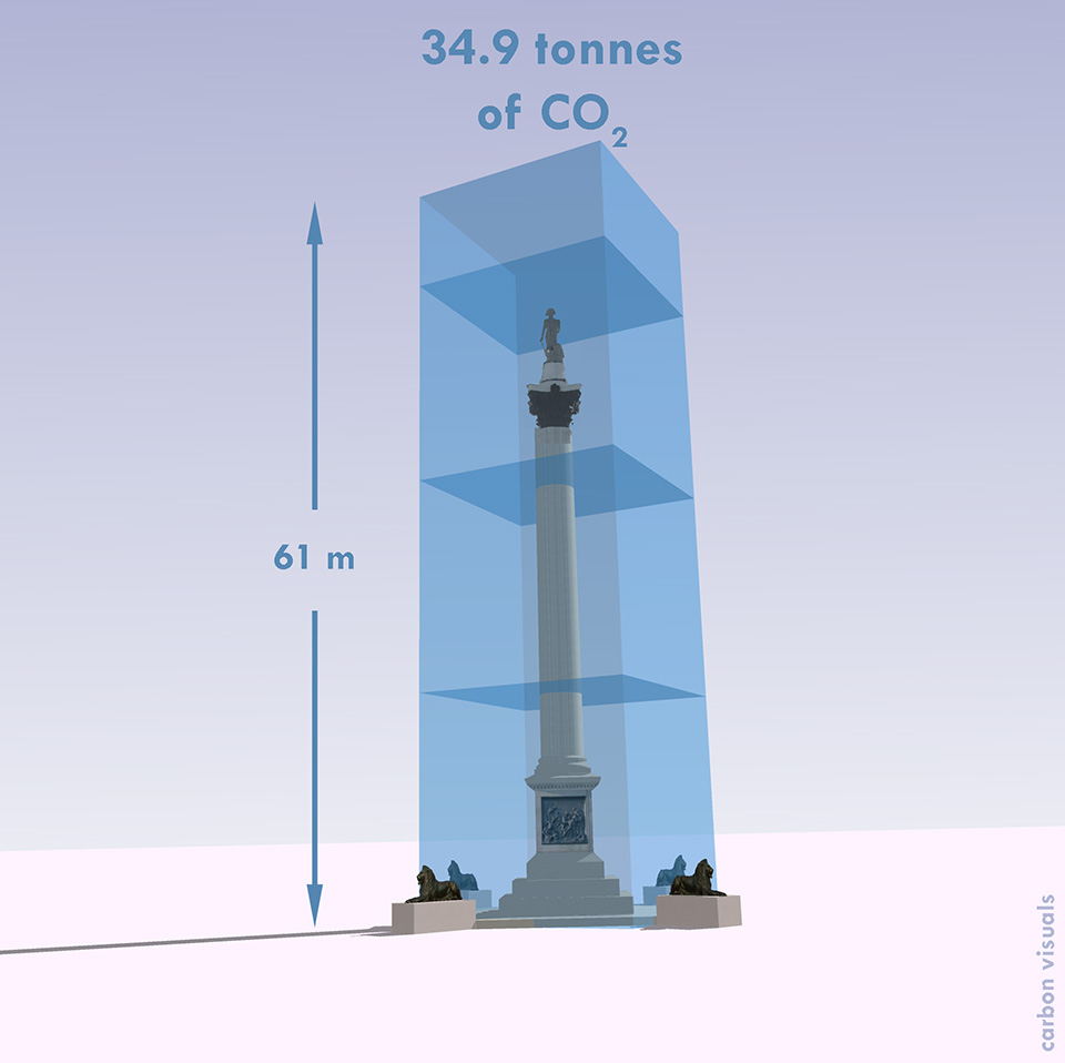
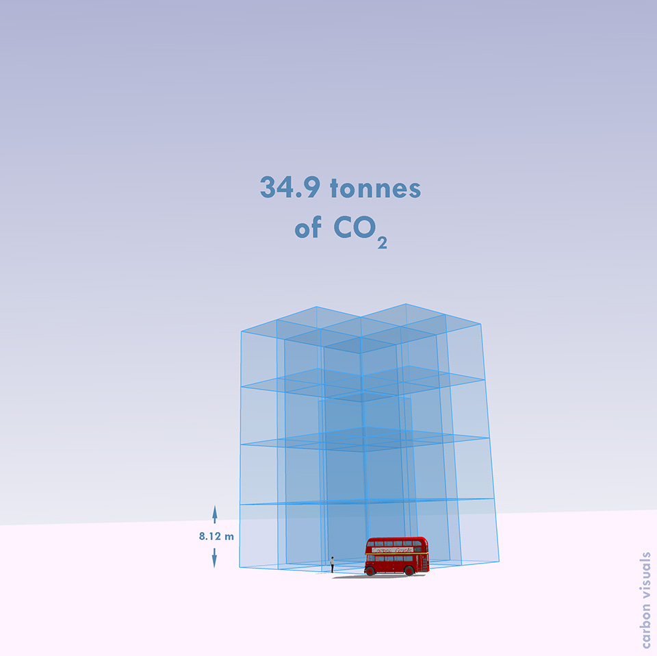
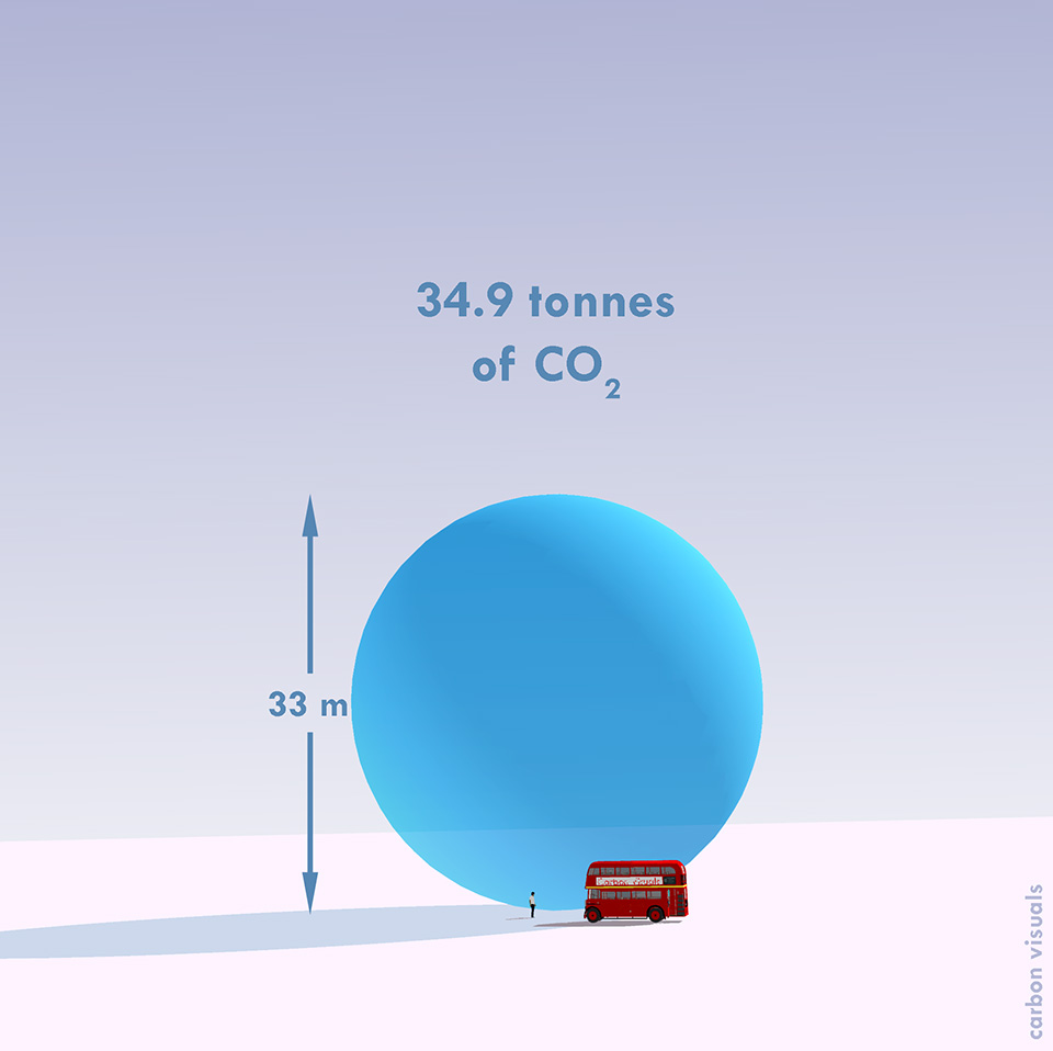
One Planet was carefully accounting for emissions arising from the making of the programme and had arrived at a figure of about 34.9 tonnes per year. But what does that mean?

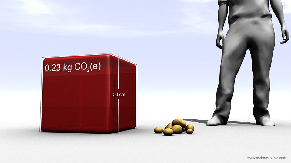
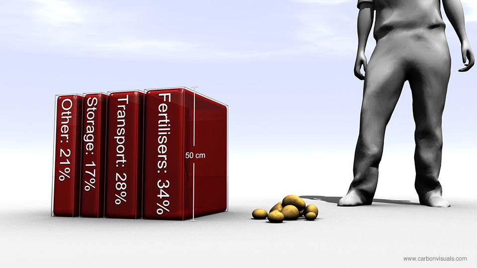
Measuring carbon dioxide in terms of mass (tonnes) makes sense from an accounting point of view but doesn't give us a sense of scale we can relate to. We examined a variety of alternative ways of representing One Planet's footprint.

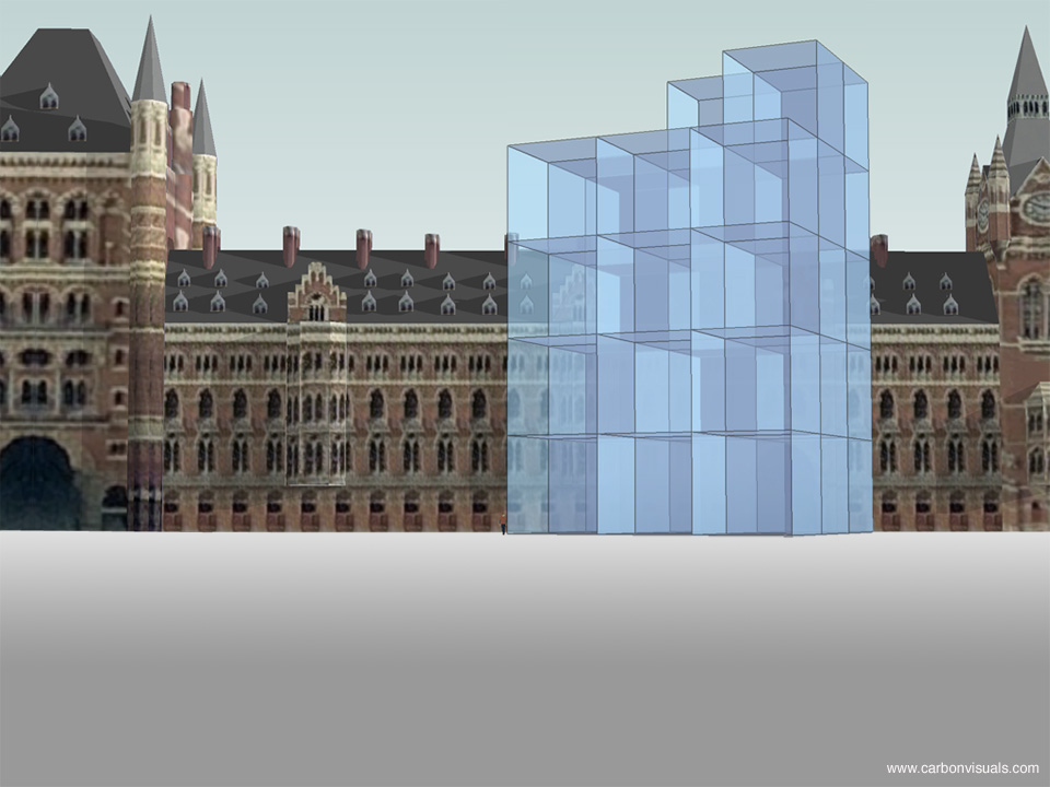
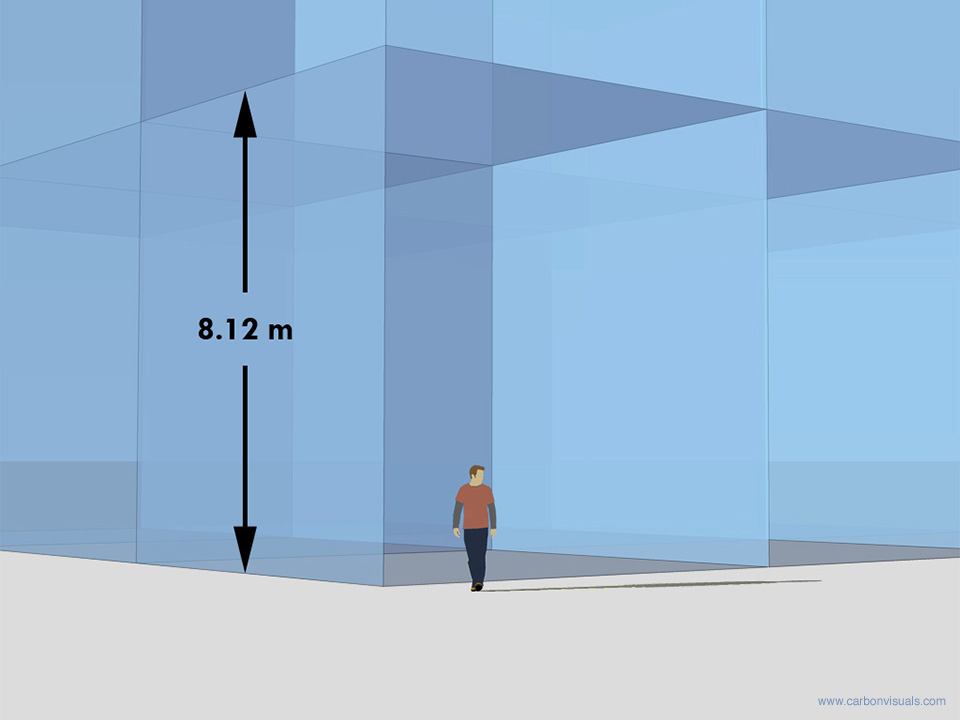
We have shown the programme's annual emissions by volume in a recognisable location and in relation to an iconic feature - Trafalgar Square and Nelson's Column. These provide a sense of scale that enable the viewer to relate to the volume.

You can hear a discussion about this project, first broadcast on Thursday 8 April 2010, by visiting the One Planet website.


Showcasing ADAS carbon consultancy capability

ADAS provides environmental solutions, rural development services and policy advice. The company is leading projects on GHG methodologies and mitigation measures for food production and agriculture in the UK.

For both simple and complex foods, the key is to understand the production processes of crops and animals in intensive, extensive and organic production systems.

The company asked Carbon Visuals to provide a series of images to showcase their carbon management consulting capability to the food and agriculture sector.

We created images depicting the carbon footprint of potatoes in relation to the production of school meals in the UK. In addition we provided an animated film showing the emissions, sequestration and stored carbon on ten Peak District farms.

Finally we produced a set of images to show the company's own carbon footprint and their reduction target. This included a comparison with the total emissions from UK agriculture - which they are able to influence through their consultancy practices.


Engaging employees at the Guardian News and Media Group

The Guardian News and Media Group turned to Carbon Visuals to get employees involved in reducing the company’s carbon footprint. On an average day between April 2007 and March 2008, GNM emitted 39 tonnes: 20 tonnes from two print sites, 14 tonnes from offices and five tonnes from business travel.

The Guardian offices are near St Pancras Station - a landmark that employees can relate to physically. Viewers can see the picture and know what such a pile of one tonne cubes would be ‘like’.

Guardian News and Media's daily carbon dioxide emissions. On an average day between April 2007 and March 2008, GNM emitted 39 tonnes: 20 tonnes from 2 print sites,14 tonnes from the old offices and 5 tonnes from business travel. One tonne of carbon dioxide gas would fill a cube of 8.12 metres high. Viewing the pile of 1-tonne cubes from eye-level can give a viewer a better sense of the height.


Helping local government involve all staff in emissions reduction

Central Bedfordshire Council needed a way to involve key stakeholders and staff in meeting targets for emissions reduction. We produced volumetric visualisations that make reference to landmarks and areas that these audiences can relate to.

We also produced animations that bring the figures to life by showing the emissions from different council activities in real-time. The Council used the visualisations in a stakeholder conference but they also found them useful for new employees, strategy documents, and the Council’s website.

These visualisations are a huge breakthrough and will enable people to clearly see the impact our carbon emissions are having on the environment and the level of responsibility that falls on each one of us to assess and change our activities.

Councillor Richard Stay, Deputy Leader, Central Bedfordshire Council

The Carbon Quilt - a global engagement tool

Instead of trying to communicate the complexities of climate change, we believe that a simple understanding of how we are changing the atmosphere of the planet could transform society’s view of the need for a low-carbon future.

Every day we wrap the planet in a paper-thick layer of carbon dioxide!

We’ve done the maths and it’s true. The 80 million tonnes of CO2 we release to the atmosphere every day by burning fossil fuels would be 80 microns thick if it were a single, uninterrupted layer at 100% concentration over our heads. Over the course of a year, that amounts to 31mm, or over an inch.

We call this imagined layer the Carbon Quilt – since pre-industrial times its thickness has increased from 2.3 metres to 3.2 metres.

In 2010, with support from The Tedworth Charitable Trust, we 'soft-launched' our Carbon Quilt web-tool that enables people to ‘see’ any carbon footprint – from a short car journey to the footprint of a country or continent. Any carbon footprint can be seen in proportion to any other, and in proportion to the global whole. It can also be positioned in a location that has meaning and provides a sense of scale for the person viewing it.

Carbon Visuals has ambitious plans to develop this technical prototype tool on Google Earth to bring the abstract concept of 'carbon footprints' to life for over a billion people worldwide.

We are now actively seeking funding and/or sponsors to help us to develop this project. Please contact us if you have funding ideas, contacts or expertise that could help advance this project.

BITC Mayday Network businesses' carbon footprint (and reduction)

BITC Mayday Network businesses' carbon footprint (and reduction)

To the left is a picture for the BITC (Business in the Community) Mayday Annual Report 2010.

Each year humans release enough carbon dioxide to cover the entire planet in a layer 37 mm thick. The proportion of this 'quilt' that reporting Mayday Network businesses are responsible for is the green 'patch'.

Total reported emissions in 2010 (green patch) is 5.6 million tonnes of CO2(e). Emission reduction in previous 12 months is shown as the dotted area.

It represents a saving of 400 thousand tonnes of CO2(e).

Global CO2 emissions in real time

How can you give people some sense of the rate at which we are adding emissions to the atmosphere?

Using 2010 data, we calculated that at standard pressure and 15oC the mean rate of emissions for that year would fill a volume the size of the UN Secretariat Building roughly seven times every four seconds. Working with our associate Lucy Blackwell we created a simple experimental low resolution animation which we have shown to live audiences on numerous occasions.

Some people find it “breath-taking”.