CLIENT
University College London Hospital
PURPOSE
To depict the carbon footprint of London's hospitals and NHS Trusts.
DESCRIPTION
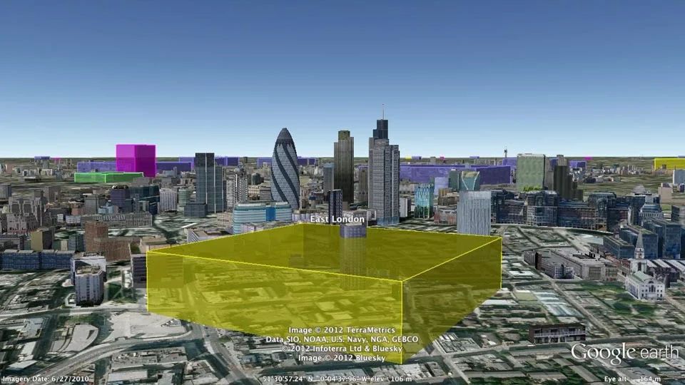
Interactive Google Earth Visualiser tool, animated film, selected snapshots showing hospitals and hospital groups and a poster.
Carbon Visuals was commissioned by UCLH (University College London Hospital), to create a set of images and a short film depicting the carbon footprint of all London's hospitals and NHS Trusts.
Data provided by UCLH was imported through the Google Earth Visualiser tool to create several KML files showing annual and daily CO2 emissions, as well as a giant Bar Chart illustrating all hospitals together. These files were then shared with the client and agreement was reached on a suitable sequence for the animated film. Finally, snapshots were created to show different hospitals and hospital groups.
The visualisations support initiatives to reduce carbon emissions in the National Health Service by providing a physical sense of scale. They have been used in conferences and workshops where facilities and energy personnel, as well as a wide range of other stakeholders, have received a better understanding of actual emissions, emissions reductions and the differences between hospitals.
Data is for emissions related to 2009/10 building energy use.
PDF summaries of data and images are available for here.
An A3 poster can be downloaded here.


