PURPOSE
To illustrate how an interactive animation can help communicate a quantified yet invisible environmental challenge
DESCRIPTION
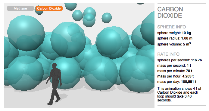
We have produced an interactive animation to visualise and bring insight to the rate at which methane is being released from a gas leak in California
In Aliso Canyon in California, a gas leak is spewing methane into the air. On the 23rd of October 2015 the leak erupted at a natural gas storage facility near Los Angeles. As of the time of writing (Jan 2016), this leak is still ongoing - at an enormous rate. We have created the interactive animation below to give insight as to the scale of that rate.
We used emissions rate data from here (report by California Air Resources Board), though we could potentially link this value to a live data feed.
We have used a figure of 84 for the CO2 global warming equivalent of methane (over a period of 20 years). This number was taken from a report published by the IPCC on Anthropogenic and Natural Radiative Forcing (chapter 8, page 714, table 8.7).
This visualisation is produced in your web browser so the quality e.g. the ‘look’ of the bubbles cannot be as sharp as in a pre-rendered animation. This also means that it may run a little slowly on some computers - switching to a different browser might help.
What does this visualisation show?
This visualisation is showing us accurate volumes of gas at (approximately) the actual rate at which they are being emitted. Each sphere represents 10 kg of gas. After 4 tonnes have been emitted the animation starts again from the beginning.
Why show Carbon Dioxide as well?
Methane is a powerful climate pollutant and greenhouse gas. It’s about 84 times more potent than carbon dioxide. This means that 1 kg of methane being emitted will have a similar effect on global warming as 84 kg of CO2. If you click the button at the top of the visualisation marked ‘Carbon Dioxide’, you will be able to see the CO2 equivalent emissions rate.
Where can I find out more?
Our friends at Environmental Defense Fund have published an informative article on the Aliso Canyon leak here.
Click here to see their aerial video showing the methane plume.
Below is their real-time methane counter which we really like.
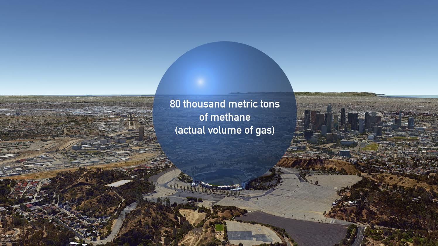
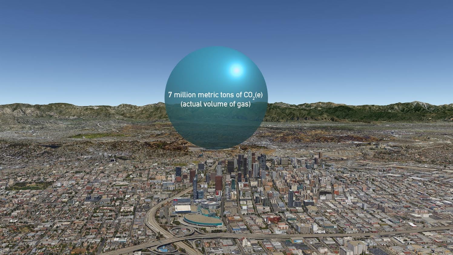
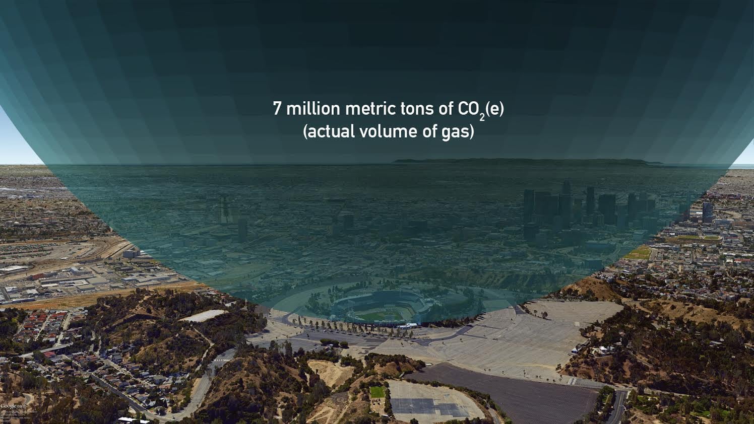
In the course of exploring different visual options we created some sketches in Google Earth. Initial sketches were created with giant bubbles located at the methane leak site but these did not work as there is no scaling object or building. Placing the bubbles in Los Angeles seemed the next best option but again the geography of the city does not help. So these are included for interest, but are not considered finished images.
Social Media Use
Simple interactives with short Vine or GIF animations can get extensive social media attention.


